I remember sitting in a dimly lit studio back in the late nineties, the smell of solvent and fresh ink heavy in the air, watching a colleague spend three days perfecting a typeface’s kerning for a client who couldn’t tell the difference between a serif and a sans-serif. We’ve spent decades chasing the high of a “perfect” visual, often falling into the trap of the aesthetic usability effect—that psychological quirk where we convince ourselves a beautiful interface is a functional one. It’s a dangerous delusion. Just because a layout is balanced and the color palette is sophisticated doesn’t mean the user isn’t hitting a brick wall the moment they try to complete a task.
I’m not here to give you a textbook definition or a lecture on cognitive psychology. Instead, I want to talk about how we can use visual harmony to support function rather than mask its absence. I’ll be sharing what I’ve learned from twenty years of refining brand identities and digital workflows, focusing on how to strike that delicate balance between beauty and utility. My goal is to help you build tools that feel intentional and effortless, ensuring your design serves the human on the other side of the screen.
Table of Contents
The Psychology of Interface Design and Emotional Resonance
When we talk about why a beautiful interface feels “easier” to use, we’re really talking about how our brains bypass logic in favor of feeling. It’s a subtle form of cognitive bias in UX design that tricks us into a state of grace. When a layout feels balanced—when the kerning is tight and the white space breathes—our brains release a small hit of dopamine. This isn’t just vanity; it’s a psychological buffer. If a tool looks intentional, we instinctively grant it more trust, assuming that the underlying logic is as polished as the surface.
However, we have to be careful not to mistake a polished veneer for a functional workflow. There is a profound difference between perceived usability vs actual usability. I’ve seen countless projects where a stunning typeface and a muted color palette masked a navigation system that was fundamentally broken. While there is a measurable impact of beauty on error tolerance—meaning users are more forgiving of minor hiccups in a gorgeous environment—we shouldn’t use aesthetics as a band-aid for poor architecture. Beauty should be the bridge that leads a user to their goal, not a distraction that keeps them from finding it.
Visual Aesthetics and User Experience as a Tool for Empowerment
When we talk about visual aesthetics and user experience, we aren’t just discussing whether a palette is “on-trend” or if the kerning is tight. We are discussing the emotional buffer that design provides. In my years of type design, I’ve seen how a well-crafted typeface can soften the blow of a steep learning curve. This is where the impact of beauty on error tolerance becomes tangible; when a tool feels intentional and refined, users are more likely to approach it with patience rather than frustration. They give the software grace because the interface itself feels respectful of their intelligence.
However, we have to be careful not to let high-fidelity polish become a mask for poor architecture. There is a dangerous gap between perceived usability vs actual usability that can lead designers into a trap of superficiality. If we use beauty to hide a broken workflow, we aren’t empowering the creator—we are merely distracting them. True empowerment happens when the visual harmony of the interface works in tandem with its utility, creating a space where the tool disappears and only the craft remains.
Beyond the Surface: Five Ways to Use Beauty Without Losing the Plot
- Don’t use polish as a band-aid for broken logic. A beautiful layout can temporarily distract a user from a confusing navigation flow, but that frustration will eventually resurface, usually right when they’re about to abandon the tool entirely.
- Prioritize hierarchy over decoration. High-contrast design and intentional whitespace aren’t just stylistic choices; they are functional signals that guide the eye to what actually matters, ensuring the aesthetic serves the task at hand.
- Respect the “friction” of meaningful interaction. While we often strive for seamlessness, sometimes a bit of tactile-feeling visual feedback—like a subtle shadow or a deliberate transition—makes a digital interface feel more human and less like a sterile, automated void.
- Audit your visual weight. It’s easy to get lost in the “pretty” details of a typeface or a color palette, but if those elements are competing for attention with the primary call to action, you’ve traded usability for mere decoration.
- Build for longevity, not trends. Trends are fleeting and often prioritize “the look” over the substance. Focus on timeless principles of proportion and clarity so your work remains functional long after the current aesthetic cycle has passed.
The Intentionality of Form
Visual appeal is a bridge, not a mask; use beauty to foster trust and emotional connection, but never let a polished interface hide a fundamental breakdown in functionality.
True empowerment comes from reducing cognitive load through harmony, ensuring that the aesthetic choices serve to guide the user’s hand rather than distract it.
Design with the human element in mind by prioritizing purposeful elegance over decorative excess, remembering that every pixel should earn its place on the screen.
The Danger of the Polished Surface
“A beautiful interface is a promise, not a solution. If we use aesthetics to mask a lack of functional depth, we aren’t designing; we’re just decorating a failure. True craftsmanship lies in ensuring the elegance of the visual doesn’t distract from the integrity of the utility.”
Ingrid Bellamy
Beyond the Surface
At the end of the day, the aesthetic usability effect isn’t a license to hide sloppy logic behind a polished veneer. We’ve discussed how visual harmony can bridge the gap between a user’s frustration and their initial learning curve, but we must remember that beauty is a promise, not a solution. If we use high-end typography and intentional whitespace simply to mask a broken user flow, we aren’t designing; we are decorating. True craftsmanship lies in the equilibrium where the visual grace of an interface actually supports the cognitive load rather than distracting from it.
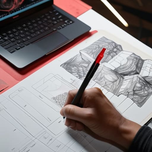
As we move deeper into an era of automated layouts and generative interfaces, I find myself returning to my sketchbook more often. It reminds me that every pixel should carry the weight of a deliberate choice. Don’t let the pursuit of a “perfect” look lead you to abandon the grit and friction that make digital tools feel human. Instead, strive to create work where the elegance of the form serves the integrity of the function. When we prioritize intentionality over mere decoration, we build tools that don’t just look better—they feel more meaningful to the people who use them.
Frequently Asked Questions
How do we draw the line between meaningful visual polish and using aesthetics to hide fundamental usability flaws?
We draw the line at intention. If a beautiful typeface or a smooth transition is used to mask a confusing navigation flow or a broken checkout process, you aren’t designing; you’re decorating a disaster. True polish should act as a lubricant for the user’s journey, not a veil. If the aesthetic doesn’t make the core task easier to complete, it’s just noise. Beauty must serve the function, never the other way around.
In a world of rapid prototyping, how can we ensure that "beauty" is integrated into the functional foundation rather than just being a layer of paint applied at the end?
We have to stop treating “look and feel” as the final polish. In my practice, I treat typography and spatial rhythm as structural elements, not decorative ones. If you wait until the wireframes are locked to think about beauty, you’ve already lost. You integrate it by making aesthetic choices—like scale, weight, and negative space—part of the functional logic from day one. Design isn’t a coat of paint; it’s the very architecture of the experience.
Can an over-reliance on the aesthetic usability effect actually diminish a user's long-term proficiency with a tool?
It can. If we lean too heavily on “eye candy” to mask friction, we’re essentially teaching users to tolerate inefficiency. When an interface feels effortless simply because it’s beautiful, users stop looking for the logic behind the workflow. They become passive consumers of a pretty screen rather than masters of a tool. True proficiency comes from understanding the mechanics, not just enjoying the gloss. We shouldn’t design for blind satisfaction; we should design for competence.