
I remember sitting in a cramped studio in Providence, my fingers stained with ink, staring at a physical layout that had taken three days of meticulous knife-work to perfect. There was a weight to that process, a tangible sense of consequence in every cut. Today, I see so many agencies drowning in a “optimized” web design workflow that feels less like a creative process and more like a factory assembly line. We’ve traded the intentionality of the craft for a frantic obsession with automated efficiency, chasing software updates and bloated project management tools that promise to save time but usually just end up cluttering our mental space.
I’m not here to sell you on a new subscription service or a “magic” productivity hack that promises to turn you into a machine. Instead, I want to talk about building a rhythm that actually works—one that respects your cognitive load and preserves the human element of design. I’m going to share the practical, battle-tested frameworks I use to keep projects moving without losing the soul of the work. We’re going to strip away the noise and focus on a workflow that prioritizes purposeful creation over mere digital output.
Table of Contents
Honoring the User Experience Design Process

When we talk about the user experience design process, it’s easy to get lost in the mechanics of wireframes and user flows. But if we treat these stages as mere technical hurdles, we lose the soul of the project. To me, a successful journey isn’t just about moving from point A to point B; it’s about understanding the emotional friction a user encounters along the way. We have to design for the person behind the screen, not just the device they are holding.
This requires a disciplined approach to the various ui design stages, where we prioritize clarity over clutter. I’ve found that if you don’t establish a strong foundation of visual hierarchy principles early on, the entire structure will feel hollow once it hits the browser. It’s about creating a sense of order that feels intuitive rather than forced. When we respect the rhythm of how people actually interact with digital spaces, we stop building mere interfaces and start building meaningful experiences.
Mastering Visual Hierarchy Principles With Purpose

When we talk about visual hierarchy, it’s easy to get lost in the mechanics of scale and color. We treat it like a math problem—making the H1 bigger or the CTA brighter—but that’s a superficial way to approach the craft. To me, true hierarchy is about directing the eye with intention. It’s the difference between a layout that screams for attention and one that guides a user through a narrative. If we aren’t careful, we end up creating digital noise rather than meaningful pathways.
In my experience, mastering visual hierarchy principles requires a deep understanding of how humans actually process information. You have to consider the weight of every element, ensuring that the most critical message doesn’t just sit on the screen, but actually commands the space. This isn’t just a decorative step; it is a fundamental part of the ui design stages that dictates how a user feels while navigating your work. When we prioritize clarity over cleverness, we respect the user’s cognitive load and build interfaces that feel effortlessly intuitive.
Five Rituals to Protect Your Creative Integrity
- Stop starting in the browser. I’ve learned the hard way that jumping straight into Figma or Framer kills the conceptual stage. Give yourself permission to stay in the tactile world—sketching on paper or using a fountain pen—to work out the spatial logic before you ever touch a pixel.
- Build a “friction buffer” into your timeline. We often treat workflows like assembly lines, but true design requires moments of stillness. Schedule specific blocks of time for deep thinking where you aren’t allowed to produce anything, only to observe and reflect on the problem you’re solving.
- Curate a living style guide from day one. Instead of chasing trends, build a foundational system of typography and spacing that feels intentional. A well-structured design system isn’t just about efficiency; it’s about maintaining a consistent visual language that respects the user’s eye.
- Audit your toolstack for “digital noise.” It is easy to get lost in a sea of plugins and automated generators, but these often strip away the soul of a project. Choose tools that act as extensions of your hand, not replacements for your judgment.
- Close the loop with a post-mortem. Once a project goes live, don’t just move to the next invoice. Look back at your process—where did the rhythm break? Where did the automation fail the intention? Use those insights to refine your next workflow, treating your process as a craft that requires constant tuning.
The Core of a Meaningful Workflow
A workflow isn’t a checklist to be completed; it is a framework meant to protect the space where real, intentional thinking happens.
True visual hierarchy is about more than just font sizes—it is about guiding a human eye through a digital space with grace and clarity.
Never let the speed of your tools dictate the quality of your craft; use technology to amplify your decisions, not to make them for you.
The Fallacy of Efficiency
A web design workflow shouldn’t be a race toward a finished file; it’s a series of intentional pauses where we decide if a pixel actually earns its place on the screen.
Ingrid Bellamy
Finding the Rhythm in the Digital Noise
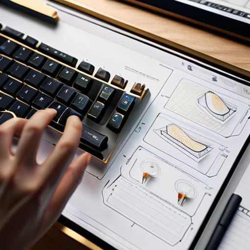
At the end of the day, a successful web design workflow isn’t about finding the fastest way to push pixels from a canvas to a live server. It’s about the intentionality we weave into the gaps between those steps. We’ve talked about the necessity of honoring the UX process and the discipline required to master visual hierarchy, but these aren’t just checkboxes on a project management board. They are the guardrails that prevent us from drifting into the mindless automation that so often plagues our industry. When we prioritize purposeful structure over mere speed, we ensure that every decision—from the weight of a typeface to the padding of a container—serves a clear, human-centric objective.
As you return to your own projects, I encourage you to resist the urge to let the tools dictate your movements. The software is there to assist you, not to define your creative boundaries. Take a moment to step away from the screen, pick up your sketchbook, and remember that the most profound digital experiences are those that feel like they were crafted by hand. We aren’t just building websites; we are designing the digital environments where people live, work, and connect. Let’s make sure we build them with the same care and intentionality we would bring to a physical piece of art.
Frequently Asked Questions
How do I balance the need for a structured workflow with the spontaneous, creative "messiness" that often leads to my best ideas?
Think of your workflow not as a cage, but as the frame for a sketch. I’ve found that structure should handle the heavy lifting—the grids, the file naming, the handoffs—so your mind is free to wander. I keep my technical process rigid to protect my creative chaos. When the logistics are automated and predictable, you create the mental breathing room necessary for those messy, unscripted breakthroughs to actually happen.
At what point in the digital workflow should I step away from the screen and return to my physical sketchbook to avoid design fatigue?
The moment you feel yourself “pixel-pushing”—adjusting a margin by a single pixel for twenty minutes without a clear reason—is your signal to leave. When the screen starts feeling like a cage rather than a tool, step away. I usually reach for my sketchbook right after the wireframing stage, before the heavy lifting of high-fidelity UI begins. It breaks the digital trance and lets you solve structural problems with ink, not just shortcuts.
How can I integrate client feedback into my process without letting their technical constraints erode the intentionality of the original design?
I treat client feedback like a grain of film—it’s part of the texture, but it shouldn’t ruin the exposure. When constraints hit, don’t just pivot; translate. Instead of defending a pixel, explain the intent behind it. If a technical limitation forces a change, find a way to honor the original logic through a different medium. We aren’t just delivering files; we’re protecting the integrity of the idea against the friction of reality.
