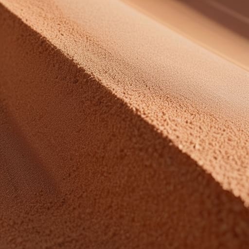
I was hunched over my drafting table in Providence, the smell of spray adhesive thick in the air, when I realized something about the way light hits a physical surface. Back then, perfection wasn’t a clean vector; it was the subtle, organic texture of a matte print or the slight tooth of heavy-weight paper. Today, I see so many designers chasing a sterile, mathematical “cleanliness” that feels utterly lifeless. They treat noise and grain in design like a mistake to be filtered out, rather than a vital tool for depth. When everything is perfectly smooth and mathematically precise, the work loses its soul, becoming nothing more than a collection of cold, clinical pixels.
I’m not here to give you a tutorial on which slider to drag in Photoshop to make things look “vintage.” Instead, I want to talk about the intentionality behind the grit. I’m going to share how to use texture to create meaningful friction in your digital layouts, ensuring your work feels grounded rather than generated. We’ll move past the superficial filters and look at how to weave a sense of human presence into your brand identities, treating texture as a deliberate craft rather than a decorative afterthought.
Table of Contents
Finding Soul Through Visual Imperfection in Ui Design
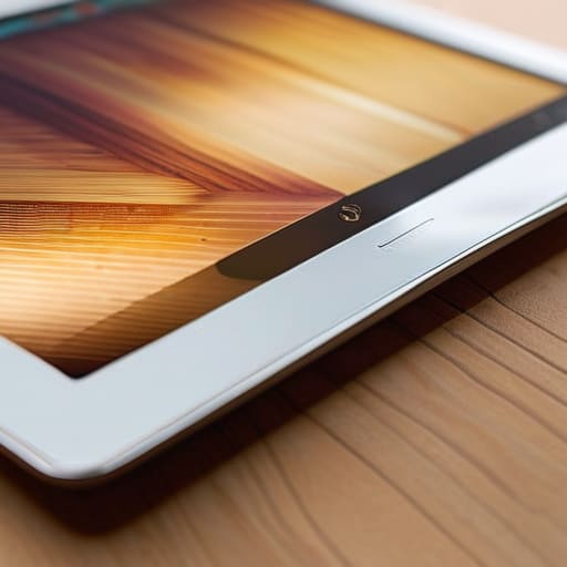
When we look at modern user interfaces, they often feel too “solved.” Everything is mathematically perfect, rendered in sterile vectors that sit on top of a glowing glass pane. There is a clinical coldness to it that can actually alienate a user. By introducing visual imperfection in UI design, we break that illusion of the machine. It’s about injecting a sense of presence into the layout—something that suggests a hand was involved in the making.
I often think about the difference between a flat color fill and a surface that has a slight, organic variance. When you layer in subtle retro aesthetic textures, you aren’t just decorating; you are providing a visual anchor. It gives the eye something to rest on, creating a sense of tactile qualities in graphic design that a standard hex code simply cannot achieve. It’s the difference between looking at a printed photograph and a digital file. That tiny bit of grit provides a necessary weight, turning a fleeting digital interaction into something that feels grounded and intentional.
Adding Depth to Digital Art via Tactile Qualities
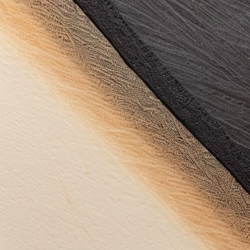
When we work in a purely vector-based environment, everything can feel unnervingly sterile. The math is perfect, the gradients are seamless, and the colors are mathematically precise—but it lacks a certain presence. By introducing tactile qualities in graphic design, we bridge the gap between the cold logic of a screen and the warmth of the physical world. It isn’t about making something look “old”; it’s about simulating the way light actually hits a surface or how ink settles into a heavy cotton paper.
I often find that the most effective way of adding depth to digital art isn’t through more shadows or complex lighting, but through subtle, layered interference. Think of it like the way a vintage Leica lens captures a scene; there is a slight, organic texture that binds the elements together. If you lean too hard into heavy overlays, you risk making the work look dated or kitschy. The goal is to find that sweet spot where the texture feels like a foundational layer of the composition rather than an afterthought applied in a single click.
A Few Rules of Thumb for Applying Texture Without Overdoing It
- Treat grain like seasoning, not the main course. A subtle layer of noise should sit quietly in the background to soften a gradient; if the user is consciously noticing the texture, you’ve likely crossed the line from “tactile” to “distracting.”
- Match your grain to your intent. If you’re aiming for a vintage, analog feel, go for a heavier, more organic clumpiness. If you just want to break up a clinical digital gradient, keep it fine and monochromatic so it feels like a natural part of the light rather than a filter.
- Watch your contrast ratios. High-contrast grain can eat away at legibility, especially with small body text. I always double-check my accessibility standards after adding texture to ensure the “grit” isn’t making the interface harder to read for someone with visual impairments.
- Use grain to create depth, not just surface decoration. By applying a slightly heavier texture to shadows and a finer grain to highlights, you can mimic how light actually hits a physical object, giving your UI a sense of three-dimensional space.
- Avoid the “default filter” trap. Most design software has a one-click noise button, but those often feel synthetic and mathematical. I prefer to layer subtle, scanned textures or custom noise patterns to avoid that overly processed, “computer-generated” look.
The Intentionality of Imperfection
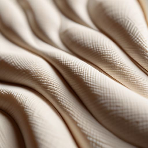
Use grain as a tool for depth, not a decorative mask; it should serve to soften harsh digital gradients and create a sense of atmosphere.
Avoid the “over-processed” look by treating digital grit like a physical layer—apply it with restraint to ensure it enhances the composition rather than cluttering the user’s eye.
Prioritize tactile resonance over clinical perfection to build trust, as subtle visual friction reminds the user that there is a human hand behind the interface.
The Case for Digital Friction
“We’ve spent so long chasing the clinical perfection of the vector that we’ve forgotten how to breathe. A little grain isn’t a flaw; it’s the visual equivalent of a thumbprint on a ceramic bowl—it’s the subtle reminder that there is a human on the other side of the glass.”
Ingrid Bellamy
The Intentionality of Imperfection
At the end of the day, integrating noise and grain isn’t about adding decoration for decoration’s sake; it’s about reclaiming the tactile depth that modern, sterile interfaces often lack. We’ve discussed how these textures can provide a sense of grounding in UI design and how they breathe life into digital art by mimicking the physical world. By introducing these subtle irregularities, we move away from the clinical, mathematical perfection of the pixel and toward something that feels lived-in. It is the difference between a flat, printed sheet of paper and a piece of heavy, cotton-rag stock that catches the light just right.
As we continue to navigate an era where automation threatens to smooth over every unique edge, I encourage you to embrace the friction. Don’t be afraid to step away from the “perfect” gradient and experiment with the grit that makes a design feel authentic. Our goal shouldn’t be to create flawless machines, but to build digital experiences that respect the human hand. Let your work have a pulse. Let it have a little bit of dust in the gears. That is where the real soul of design resides.
Frequently Asked Questions
How do I balance adding texture without making the UI feel heavy or distracting from the actual content?
It’s a delicate dance. I always tell my clients to treat texture like seasoning—it should enhance the flavor, not become the meal. Keep your grain subtle and low-contrast; if the user has to squint to see the button through the grit, you’ve gone too far. Use it to add depth to backgrounds or large containers, but leave your typography and primary call-to-actions clean. Let the texture live in the periphery, not the center.
Are there specific grain patterns or noise levels that work better for accessibility and readability?
It’s a delicate balance. If you go too heavy, you’re essentially creating visual static that fights against the legibility of your typography. I always suggest keeping noise subtle—think of it as a texture, not a filter. For high-stakes readability, use fine-grained, monochromatic noise rather than heavy, colorful speckles. You want to soften the clinical edges of a digital canvas without creating enough “jitter” to distract the eye from the actual content.
What are the best ways to implement these tactile effects without bloating the file size or slowing down site performance?
It’s a delicate balance. You don’t want to chase aesthetics at the expense of usability. I usually avoid heavy, high-resolution grain overlays. Instead, I lean on subtle CSS noise filters or tiny, tiled SVG patterns. They provide that organic grit without the heavy lifting of a massive PNG. If you must use an image, keep it low-contrast and compress it aggressively. The goal is to suggest texture, not to weigh down the browser.
