
I remember sitting in a cramped studio back in the late nineties, the air thick with the scent of spray adhesive and the rhythmic clack-clack of a mechanical keyboard. We weren’t clicking through presets; we were physically layering translucent inks to achieve a sense of depth. Today, I see so many designers treating gradient styles like a cheap shortcut, slapping a muddy, high-saturation blur over a layout just to mask a lack of structural intent. It feels hollow. When we use color transitions merely to “fill the space” or follow a fleeting trend, we lose that essential sense of weight that makes a digital interface feel grounded in reality.
I’m not here to show you how to use the latest trendy sliders or automated generators that strip the soul out of your work. Instead, I want to talk about how to use color transitions with deliberate purpose. We are going to explore how to approach gradient styles as a tool for hierarchy and light, rather than just decoration. My goal is to help you move past the superficial fluff and rediscover the craft of building depth that actually respects the human eye.
Table of Contents
Mastering Color Theory in Gradients to Honor Intent
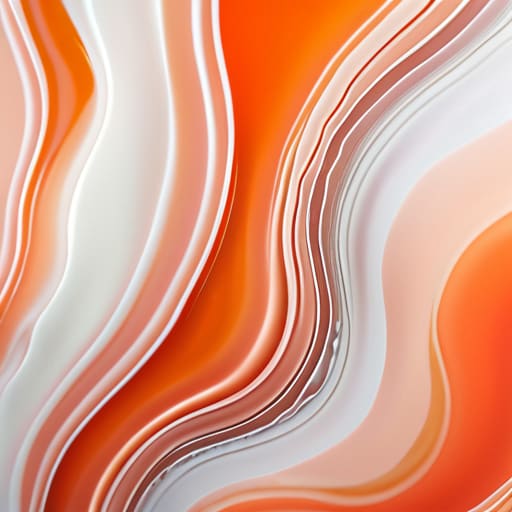
When I sit down with my sketchbook to map out a new brand identity, I don’t start with hex codes; I start with the mood. In the digital realm, it’s easy to get lost in the infinite spectrum, but true intentionality requires us to ground our choices in fundamental color theory in gradients. A common mistake I see in modern UI design is the use of “clashing” transitions that feel jittery or artificial. Instead, I prefer to select adjacent hues on the color wheel to create a sense of organic flow. When you respect the relationship between colors, the transition feels less like a mathematical calculation and more like a natural shift in light.
Choosing between linear vs radial gradients is also a matter of directing the viewer’s focus rather than just following a trend. A linear path can provide a sense of structural stability, perfect for grounding a layout, while a radial approach can mimic the soft, directional glow of a single light source. It’s about creating depth that feels earned. We aren’t just filling space; we are crafting an atmosphere that invites the user to linger.
Beyond Aesthetic Background Trends Building Meaningful Depth
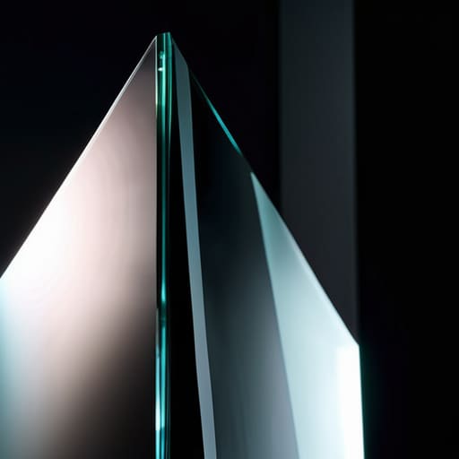
We often see designers falling into the trap of chasing fleeting aesthetic background trends, treating color transitions as mere wallpaper to fill empty space. But if we look closer, a gradient shouldn’t just be a decorative layer; it should function as a structural element. When I’m sketching out a new brand identity, I think about how light actually interacts with physical objects. In a digital space, we can mimic that weight by choosing between linear vs radial gradients to suggest volume or direction. A linear shift can create a sense of movement across a page, while a radial approach can draw the eye toward a specific focal point, much like a spotlight in a dark studio.
True depth comes from understanding how these shifts influence the hierarchy of your interface. It isn’t about making things look “glossy” or “futuristic”; it’s about using subtle transitions to define boundaries and provide a sense of tactility. When we move away from flat, lifeless surfaces and toward intentional shifts in value, we stop designing for screens and start designing for human perception.
The Practitioner’s Checklist: Applying Intentional Gradients
- Stop using default linear presets. A straight line from point A to point B often feels sterile and mechanical. Instead, experiment with radial or mesh gradients to mimic how light actually behaves in a physical space—it’s rarely a perfect, mathematical stripe.
- Watch your midtones. The biggest mistake in digital gradients is the “gray dead zone”—that muddy, desaturated strip that appears when you transition between two distant hues. Always add a subtle third color at the midpoint to keep the transition vibrant and alive.
- Respect the hierarchy of light. A gradient shouldn’t just be a decorative wash; it should act as a directional cue. Use your brightest points to draw the eye toward your primary call-to-action, rather than letting the color compete with the content.
- Test for accessibility before you commit. High-contrast design isn’t just a stylistic choice; it’s a functional necessity. Ensure your text remains legible against your gradient transitions, especially for users with visual impairments who rely on clear value distinctions.
- Limit the complexity. Just because we have the tools to create infinite color blends doesn’t mean we should. If a gradient starts feeling like noise, strip it back. The most sophisticated work often relies on the subtlest shift in tone to create depth without overwhelming the user.
The Intentionality of the Gradient
Stop treating gradients as a decorative afterthought; treat them as a structural tool meant to guide the eye and establish a hierarchy of importance.
Respect the physics of light by ensuring your transitions feel organic rather than synthetic, mirroring the subtle shifts we see in the physical world.
Prioritize accessibility over trends by verifying that your color transitions don’t sacrifice legibility or create visual noise that fatigues the user.
The Friction of Color
A gradient shouldn’t just be a decorative layer used to mask a lack of direction; it should act as a subtle, intentional guide that respects the eye’s natural movement across the canvas.
Ingrid Bellamy
The Intentionality of Light and Color

As we move away from treating gradients as mere decorative filler, we return to the core of what design actually is: a way to direct attention and evoke feeling. We’ve explored how mastering color theory prevents muddy transitions, and how depth should serve a functional purpose rather than just chasing a fleeting trend. When you stop viewing a gradient as a “style” and start seeing it as a deliberate manipulation of light and space, your work gains a level of sophistication that automation simply cannot replicate. Remember, the goal isn’t to make the screen look expensive; it’s to ensure that every shift in hue respects the user’s visual journey.
In an era where tools can generate a thousand perfect transitions in a single click, our value lies in the “why” behind the “what.” Don’t let the ease of digital tools strip the soul out of your compositions. Instead, use these tools to honor the subtle, imperfect nuances of the real world—the way light hits a textured wall or how colors bleed together at dusk. Let your work be a testament to intentional craftsmanship. When you design with purpose, you aren’t just filling a canvas; you are building a bridge between the digital interface and the human experience.
Frequently Asked Questions
How do I ensure that a complex gradient doesn't compromise the accessibility or legibility of the text layered on top of it?
It’s easy to get lost in the beauty of a transition and forget that, at the end of the day, the type has to do its job. If your gradient is fighting your text, the design has failed. I always run a contrast check against the darkest and lightest points of the shift. If you can’t pass WCAG standards across the entire spectrum, don’t use that gradient. Instead, try adding a subtle, semi-transparent scrim or an overlay to ground the letters.
At what point does a gradient stop feeling like a purposeful design choice and start feeling like a decorative distraction?
It becomes a distraction the moment it stops serving the hierarchy. If I can’t tell whether the gradient is meant to draw my eye to a call-to-action or if it’s just masking a lack of structural confidence, it’s failed. A purposeful gradient creates depth or directs movement; a decorative one just creates visual noise. When the color begins to compete with the content rather than supporting it, you’ve crossed the line from craft into clutter.
When working with limited color palettes, how can I create depth through gradients without making the interface feel muddy or dated?
When you’re working with a tight palette, the temptation is to stretch colors until they lose their soul. To avoid that muddy, “early 2000s” look, don’t just pick two distant hues and hope for the best. Instead, lean into monochromatic shifts. Use subtle variations in luminosity and saturation rather than changing the hue entirely. It’s about creating a soft transition of light, not a collision of pigments. Think of it as sculpting with light.
