I still remember the smell of rubber cement and the precise, tactile resistance of X-Acto blades cutting through heavy cardstock back in my studio days at RISD. There was a certain necessary friction in those physical layers—a way that the edges felt alive because they weren’t mathematically perfect. Lately, I’ve been watching the discourse around digital collage art shift toward a sort of sterile perfectionism. People are getting lost in endless layers of software presets and AI-generated textures that feel technically flawless but entirely hollow, as if they’re trying to bypass the very soul of the medium just to save a few minutes of work.
I’m not here to teach you how to click a button and call it art. Instead, I want to share how we can use modern tools to reclaim that lost sense of intentionality and human imperfection. My goal is to walk you through a process that respects the craft, moving past the superficial hype to help you build compositions that actually carry weight. We’re going to look at how to integrate digital elements without losing the grit, ensuring your work feels like it was actually made rather than just rendered.
Table of Contents
- Mastering Visual Storytelling Through Collage and Intent
- Using Texture Overlays in Digital Art to Defy Perfection
- Finding the Soul in the Pixels: Five Ways to Keep Your Collage Human
- Bringing Intention Back to the Digital Canvas
- The Soul in the Software
- Finding the Soul in the Software
- Frequently Asked Questions
Mastering Visual Storytelling Through Collage and Intent
When I sit down with my sketchbook, I’m rarely looking for perfection; I’m looking for a feeling. The same should apply when you move into the digital realm. Mastering visual storytelling through collage isn’t about how many layers you can stack before the file becomes unmanageable; it’s about the narrative weight of each element. Every cutout, every grain, and every shadow must justify its existence. If a piece of imagery doesn’t contribute to the emotional core of your composition, it’s just noise.
To avoid that sterile, “too-clean” computer look, I often lean into texture overlays in digital art. I find that adding a subtle layer of paper grain or a slight light leak can bridge the gap between a cold pixel and a warm memory. It’s about creating a sense of history within the frame. Whether you are experimenting with complex photomanipulation software or simple layering, the goal remains the same: use the technology to amplify the intent, not to mask a lack of direction. Don’t let the tools dictate the story; let the story dictate how you use the tools.
Using Texture Overlays in Digital Art to Defy Perfection
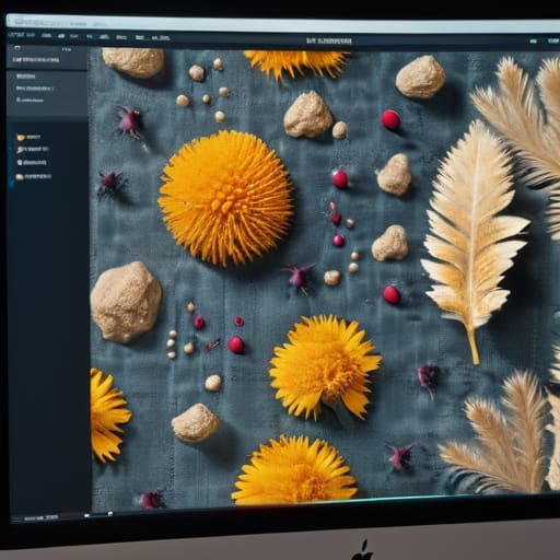
The problem with modern software is that it’s too good at being clean. We have these incredibly powerful photomanipulation software suites that can render a pixel-perfect gradient or a razor-sharp edge in milliseconds, but that precision often feels sterile. It lacks the soul of something that has actually existed in the physical world. To counter this, I rely heavily on texture overlays in digital art to introduce a sense of history and weight. Whether I’m layering a scanned piece of weathered linen or a bit of grit from a dusty film negative, these elements act as a bridge between the screen and the tactile reality we crave.
When I’m working, I don’t want my compositions to look like they were generated by an algorithm. I want them to feel lived-in. By utilizing various digital scrapbooking techniques—like subtle grain or paper creases—I can break up the mathematical perfection of a digital canvas. It’s about finding that sweet spot where the layers don’t just sit on top of one another, but actually seem to bleed and interact, creating a sense of depth that mimics the vintage aesthetic digital collage style I’ve always admired.
Finding the Soul in the Pixels: Five Ways to Keep Your Collage Human
- Prioritize the “Wrong” Scale. AI and automated tools love perfect proportions, but human eyes crave tension. Don’t be afraid to pair a massive, oversized botanical element with a tiny, delicate portrait; that visual friction is where the story lives.
- Curate Your Digital Scrapbook. Before you even open your software, gather high-resolution scans of real-world artifacts—torn edges of linen paper, old postage stamps, or even a smudge of graphite. Using real-world scans as your base prevents your work from feeling like a sterile collection of stock vectors.
- Embrace the Non-Linear Path. Avoid the temptation to follow a clean grid. Digital collage thrives when you allow elements to overlap in ways that feel accidental rather than calculated. Let a stray shadow or a bit of “visual noise” break the perfection of your composition.
- Master the Art of the Mask, Not the Erase. Instead of using a hard eraser tool that leaves jagged, digital-looking edges, use soft-edged layer masks. This allows you to blend elements with a painterly quality, mimicking the way physical paper layers sit atop one another.
- Layer with Intentional Depth. Digital art often flattens everything into a single plane. To fight this, use subtle drop shadows or light overlays to create a sense of physical space. You want the viewer to feel like they could reach into the screen and pick up a piece of the collage.
Bringing Intention Back to the Digital Canvas
Stop chasing pixel-perfect alignment; instead, look for the subtle “errors” and organic textures that mimic the tactile resistance of paper and ink.
Every element in your collage must earn its place on the screen by serving a specific narrative purpose rather than just acting as visual filler.
Use digital tools to amplify your unique creative voice, not to automate away the thoughtful, messy decision-making that makes art feel human.
The Soul in the Software
Digital collage isn’t about the seamless blending of layers; it’s about finding the tension between the precision of a pixel and the beautiful, jagged memory of a physical scrap.
Ingrid Bellamy
Finding the Soul in the Software
At its core, digital collage isn’t about the sheer volume of assets you can drag onto a canvas; it’s about the intentionality of the assembly. We’ve discussed how storytelling requires more than just aesthetic placement, and how texture serves as the vital bridge between a sterile screen and a tactile reality. By leaning into purposeful composition and embracing the grit of overlays, you aren’t just making a graphic—you are constructing a narrative. The goal is to move past the “click and drop” mentality and instead use your tools to honor the friction that makes art feel alive.
As you move forward with your next project, I encourage you to resist the urge to “clean up” every stray edge or smooth out every inconsistency. The most compelling digital work often lives in those small, imperfect gaps where the human element peeks through. Don’t let the software dictate your limits; instead, use it to amplify your unique perspective. Remember, the most powerful tool in your kit isn’t a plugin or a high-resolution texture—it is your own unfiltered creative intuition. Keep your sketchbook close, keep your eyes observant, and never stop searching for the soul within the pixels.
Frequently Asked Questions
How do I find a balance between digital convenience and that raw, tactile feeling of physical paper?
It comes down to how you approach your tools. Don’t let the software do all the heavy lifting. I find balance by intentionally reintroducing friction: scan your own torn edges, use high-resolution scans of vintage paper, or even photograph your physical sketches to bring into the workspace. The goal isn’t to mimic a scan, but to honor the way light hits a real surface. Use the digital speed to iterate, but let the tactile soul guide the composition.
Which software tools actually allow for creative experimentation rather than just automating the entire process?
I tend to steer away from the “one-click” miracle tools. They often strip away the soul of the work. If you want actual agency, I look toward Adobe Photoshop for its depth, but only if you use it to manipulate, not just automate. For something more tactile, Affinity Photo offers a wonderful sense of control. Honestly, even a simple tablet and a stylus can feel more intentional than any AI-driven generator ever will.
How can I maintain a cohesive brand identity when working with such a fragmented and diverse set of visual elements?
The trick isn’t in making everything look identical; it’s in finding a common thread. I always lean on a disciplined color palette and a consistent typographic hierarchy to act as the “glue.” Think of it like a well-curated gallery—the art pieces might be wildly different, but the lighting and the walls hold them together. Establish a few foundational constraints, and then let the chaos of your collage live within them.
