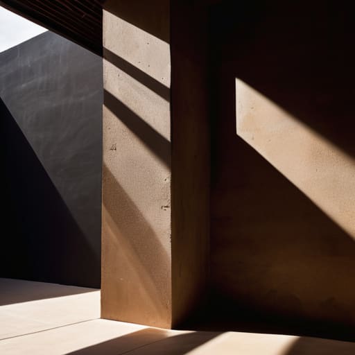
I remember sitting in a dimly lit studio back in the late nineties, hunched over a drafting table with a single desk lamp casting long, dramatic shapes across my vellum. There was a specific, heavy tension in how light and shadow defined the edge of a letterform or the curve of a logo; it wasn’t something you could just toggle on with a software preset. Today, I see so many designers treating depth like a decorative afterthought, slapping on generic, muddy drop shadows just to satisfy a client’s desire for “pop.” It’s a hollow way to work, and frankly, it strips the soul out of the interface.
I’m not interested in teaching you how to use a specific plugin or follow a trendy UI kit. Instead, I want to talk about how we can use contrast to restore a sense of intentionality to our digital spaces. I’ll be sharing what I’ve learned from decades of moving between physical ink and digital pixels, focusing on how to use light and shadow to guide the eye and create meaningful tactile depth. We’re going to move past the fluff and get back to the craftsmanship that makes a design actually feel human.
Table of Contents
- Visual Storytelling Through Lighting and Human Intent
- The Composition and Light Interplay of Real Texture
- Five Ways to Bring Tactile Depth to Your Digital Canvas
- Moving Beyond the Surface: Three Principles for Intentional Light
- The Soul in the Contrast
- Beyond the Pixel: Finding the Soul in the Shadows
- Frequently Asked Questions
Visual Storytelling Through Lighting and Human Intent
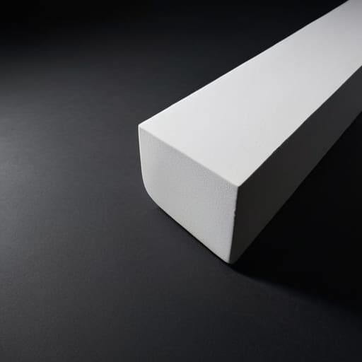
When I’m working on a brand identity, I often think about how we can move beyond mere decoration to find true visual storytelling through lighting. In my early days of analog photography, you couldn’t just “undo” a bad exposure; you had to understand how light behaved physically. I try to bring that same reverence to digital interfaces. It isn’t about making an element look “3D” for the sake of a trend; it’s about using the artistic use of shadows to imply weight, importance, and hierarchy. A shadow should tell the user where they are standing in relation to the information.
If we treat light as a tool for guidance rather than just a way to brighten a pixel, we create a sense of presence. I’ve seen too many designers lean on flat, sterile layouts that feel hollow because they lack depth. By applying basic cinematic lighting principles, we can direct a viewer’s gaze with intention, much like a cinematographer uses a spotlight to anchor a scene. It’s about creating a digital environment that feels intentional and inhabited, rather than just another empty grid on a glowing screen.
The Composition and Light Interplay of Real Texture

When I’m hunched over my workbench, cleaning the dust from a Leica lens, I’m reminded that perfection is often found in the imperfections. In digital design, we frequently fall into the trap of making surfaces look unnaturally smooth, as if they’ve been scrubbed of all history. But true depth comes from understanding the composition and light interplay of actual material. Whether it’s the grain of heavy-weight watercolor paper or the subtle grit of a brushed metal casing, light doesn’t just sit on top of a surface; it reacts to it. It catches on the microscopic peaks and settles into the valleys.
If we want to move away from the sterile, “flat” feeling of modern UI, we have to stop treating textures as mere overlays. Instead, we should study how cinematic lighting principles apply to the digital plane. When you simulate the way a single light source rakes across a textured surface, you aren’t just adding a filter; you are creating a sense of physical weight. This intentionality gives the user a subconscious cue that the space they are navigating has substance and soul.
Five Ways to Bring Tactile Depth to Your Digital Canvas
- Stop using generic drop shadows. Instead, think about the light source. If your “object” is a button or a card, decide where the sun is hitting it. A consistent light direction creates a sense of physical presence that a random blur simply cannot replicate.
- Embrace the grit of imperfect gradients. In the real world, light doesn’t transition in a mathematically perfect linear path. Use subtle, non-linear shifts in tone to mimic how light actually hits a surface, giving your work a breathing, organic quality.
- Use shadow to define hierarchy, not just depth. A shadow shouldn’t just make something look “raised”; it should tell the user which layer of information is most urgent. Use the weight of the darkness to guide the eye toward the most meaningful interaction.
- Respect the “negative” space of light. Sometimes, the most powerful way to highlight an element isn’t by adding shadow, but by allowing light to bleed around the edges. This “rim lighting” effect can make a digital interface feel less like a flat screen and more like a curated object.
- Avoid the trap of high-contrast sterility. While I love a sharp edge, true craftsmanship lies in the mid-tones. Don’t let your shadows turn into black voids; keep them nuanced and integrated with your color palette so the transition feels soft, human, and intentional.
Moving Beyond the Surface: Three Principles for Intentional Light
Stop treating shadows as mere UI decorations; use them as structural tools to create a sense of depth and hierarchy that respects how the human eye naturally perceives physical space.
Prioritize the “friction” of light by mimicking how it interacts with real-world textures, ensuring your digital interfaces feel grounded and tactile rather than sterile and flat.
Always design with purpose behind every highlight, ensuring that light serves to guide the creator’s eye toward meaningful interactions rather than just filling empty pixels.
The Soul in the Contrast
Shadows aren’t just absences of light; they are the anchors that give a digital interface its weight. If we strip away the nuance of depth to chase a flat, sterile perfection, we lose the very thing that makes a design feel human: the sense that it exists in a world we can actually touch.
Ingrid Bellamy
Beyond the Pixel: Finding the Soul in the Shadows

We have explored how light and shadow are not merely aesthetic choices or mathematical values to be toggled in a software menu. We’ve seen how intentional lighting serves as a narrative tool, guiding the eye through a composition just as a well-placed highlight directs a viewer’s attention in a physical photograph. By respecting the interplay of texture and the way light interacts with perceived surfaces, we move away from the flat, sterile emptiness that often plagues modern interfaces. We aren’t just manipulating pixels; we are curating a sense of presence that acknowledges the complexity of the physical world. When we apply these principles, we bridge the gap between the digital void and the tactile reality that our brains inherently crave.
As you return to your canvases and your code, I urge you to resist the urge to automate every nuance of your lighting. There is a specific kind of magic found in the imperfection—the way a shadow falls slightly off-center or how a light source feels warm and lived-in. Don’t let the pursuit of digital perfection strip away the humanity of your craft. Instead, use these elements to create depth, to foster connection, and to honor the friction that makes design feel real. Let your work be a reminder that even in a world of infinite screens, there is still a profound need for intentionality and soul.
Frequently Asked Questions
How do I balance the use of shadow to create depth without making a digital interface feel heavy or cluttered?
Stop thinking about shadows as “effects” and start thinking about them as breathing room. The mistake most designers make is using heavy, muddy drops shadows to force depth. It’s suffocating. Instead, use subtle, layered gradients that mimic how light actually falls across a surface. Keep your shadows soft and your transitions gradual. If the interface feels heavy, you aren’t creating depth—you’re just adding weight. Let the light do the heavy lifting.
In a world of flat design, how can I use lighting to suggest texture without losing that clean, minimalist aesthetic?
The mistake most people make is trying to mimic reality too literally. You don’t need heavy gradients or complex bevels to suggest depth. Instead, think about how light hits a physical surface—it’s about the subtle shifts in value. Use soft, directional shadows to imply a slight elevation, or a minute change in luminance to suggest a grain. It’s not about adding “stuff”; it’s about using light to respect the space the object occupies.
When designing for different screen types, how do I ensure the intentionality of my light and shadow work translates across varying levels of color accuracy and brightness?
Don’t chase absolute color accuracy; you’ll lose the battle against hardware limitations. Instead, focus on the logic of the contrast. If your shadow relies on a specific hex code to feel “deep,” it’s fragile. Aim for tonal relationships that hold their integrity even when a screen’s brightness is cranked or the gamut is narrow. Design for the way light behaves, not just how it looks on my calibrated monitor. Build for the intention, not the pixel.
