I remember sitting in a dimly lit studio back in the late nineties, the smell of ozone and stale coffee hanging in the air as I struggled to transition from physical X-Acto blades to the early, clunky iterations of digital tools. There was a specific, tactile frustration in trying to translate the soul of a hand-drawn line into something mathematical and sterile. Most modern tutorials treat a vector illustration guide like a mere technical manual—a dry list of commands and shortcut keys that promises perfection through software mastery. But they miss the point entirely; they teach you how to move points, but they never teach you how to breathe life into a shape.
I’m not here to give you a checklist of buttons to click or to sell you on the idea that more complex paths equal better design. Instead, I want to share a way of working that prioritizes intentionality over automation. This guide is my attempt to bridge that gap, offering you a practical, no-nonsense framework for using vector tools to amplify your unique creative voice rather than drowning it in mathematical precision. We are going to focus on how to maintain that essential human friction while leveraging the scalability of the digital medium.
Table of Contents
- Choosing Your Medium Understanding Vector vs Raster Graphics
- The Soul of the Curve Mastering Mathematical Paths in Design
- Intentionality Over Automation: 5 Principles for Meaningful Vector Work
- The Intentionality of the Path
- Beyond the Anchor Point
- Beyond the Anchor Points
- Frequently Asked Questions
Choosing Your Medium Understanding Vector vs Raster Graphics
When I first started out, the distinction between these two formats felt like a technicality. Now, it feels more like a fundamental choice in how we approach a project’s soul. When we talk about vector vs raster graphics, we aren’t just discussing file extensions; we are deciding whether our work is built on pixels or mathematical paths in design. Raster images—your typical photographs—are beautiful because of their organic complexity, but they are tethered to a specific resolution. If you stretch them too far, the illusion breaks, and you’re left with nothing but digital noise.
Vectors, however, offer a different kind of freedom. Because they are defined by points and paths rather than a grid of colored squares, they possess an infinite scalability that feels almost structural. This makes them indispensable for branding and iconography, where a logo must look as sharp on a tiny business card as it does on a massive billboard. Mastering digital illustration techniques within a vector environment requires a different kind of discipline—one that favors clean geometry and intentionality over the messy, tactile spontaneity of a brushstroke.
The Soul of the Curve Mastering Mathematical Paths in Design
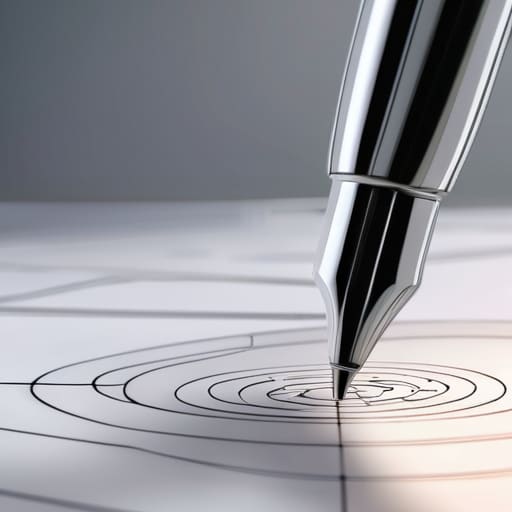
When I first started working with physical paste-ups, every line had a physical weight. Transitioning to the digital realm, I realized that many designers treat the software as a magic wand rather than a precision instrument. To truly master vector work, you have to move past simply clicking points and start understanding the underlying logic of mathematical paths in design. Every curve is a calculated relationship between anchor points and handles; if you don’t respect that relationship, your work will always feel “jittery” or accidental.
Achieving true pen tool mastery isn’t about how many buttons you know, but about knowing when to let a line breathe. I often tell my clients that a path should be as efficient as possible—fewer points usually result in smoother, more elegant transitions. When you overcomplicate your paths, you create technical debt that complicates everything from scaling to animation. By focusing on the intentionality of every single node, you move away from “drawing” and toward a form of digital craftsmanship that honors the precision of the medium.
Intentionality Over Automation: 5 Principles for Meaningful Vector Work
- Resist the urge to click every anchor point into existence; seek the fewest points possible to create a curve that feels organic rather than mechanical.
- Treat your stroke weights with the same respect you would a physical pen, ensuring they provide structural hierarchy instead of just being a default setting.
- Stop treating layers like a digital junk drawer; name them and group them with the same discipline you’d use when organizing a physical print shop.
- Avoid the “perfectly symmetrical” trap by introducing subtle, intentional irregularities that mimic the slight imperfections of a hand-drawn line.
- Use color palettes that respect negative space, remembering that what you leave out of the illustration is often as vital as what you put in.
The Intentionality of the Path
Stop treating anchor points like digital clutter; every single point you place should serve a structural purpose in the curve, rather than just being a byproduct of clicking around.
Recognize that vectors aren’t just about infinite scalability, but about the precision of geometry—use that mathematical clarity to build shapes that feel stable and deliberate.
Avoid the temptation to over-complicate; a clean, minimal path with fewer points often carries more visual weight and intentionality than a cluttered, messy one.
Beyond the Anchor Point
A vector guide shouldn’t just teach you how to manipulate paths; it should teach you how to breathe intention into them. If you’re just clicking points to fill a layout, you’re a technician. If you’re using those curves to guide the eye and honor the geometry of the form, you’re a designer.
Ingrid Bellamy
Beyond the Anchor Points
At the end of the day, mastering vector illustration isn’t about memorizing every shortcut in your software or perfectly calculating every Bézier curve. It’s about understanding the fundamental shift from the pixel-bound constraints of raster images to the infinite, mathematical freedom of paths. We’ve explored how to choose the right medium for your project and how to find the rhythm within those mathematical curves, but the technical foundation is only half the battle. The real work lies in how you apply these tools to maintain visual integrity across every scale, ensuring your designs remain as sharp on a billboard as they are on a smartphone screen. Remember, the goal is intentionality, not just technical proficiency.
As you move forward, I encourage you to treat your digital canvas with the same reverence I give to my vintage Leica or a fresh page in my sketchbook. Don’t let the automation of modern software strip away your unique perspective. Use vectors to build structures that are clean and scalable, but always leave room for the human friction that makes a design feel alive. Tools are meant to extend our reach, not dictate our vision. Go out there and build something that doesn’t just fill a screen, but actually commands attention through thoughtful, purposeful craft.
Frequently Asked Questions
How do I know when a project has crossed the line from intentional vector work into something that feels sterile or overly mechanical?
You know you’ve crossed that line when the math starts to outshine the meaning. If every curve is mathematically perfect and every anchor point is placed with robotic precision, the work loses its pulse. It feels sterile when there’s no visual tension—no slight imperfection or “human” weight to the strokes. When the design stops feeling like a choice and starts feeling like a default setting, you’ve traded intentionality for mere efficiency.
Is there a way to introduce a sense of "human friction" or organic imperfection into mathematically perfect paths without losing scalability?
It’s the classic tension, isn’t it? The math is perfect, but perfection is sterile. To find that “human friction,” I suggest working with variable stroke weights or introducing slight, intentional asymmetries in your anchor points. Don’t let the software smooth everything into a clinical curve. Instead, treat your paths like a pen stroke on paper—allow for a bit of weight fluctuation. You keep the scalability of the vector, but you regain the soul of the hand.
When building a brand identity, how do I decide which elements should remain crisp vectors and which parts might benefit from the texture of a raster-based approach?
Think of it as a balance between structure and soul. Your core marks—logos, typography, and primary iconography—must be vectors. They are the architecture of the brand; they need to be indestructible and infinitely scalable. However, don’t be afraid to introduce raster textures for secondary elements like background patterns or photography overlays. That grit, that slight imperfection, provides the human friction that prevents a brand from feeling clinical and sterile.