I was sitting at my desk last Tuesday, staring at a perfectly rendered, mathematically flawless vector script that some designer had spent hours “perfecting,” and I felt nothing. It was sterile. It was dead. We’ve reached this strange point in digital design where we use software to mimic the organic, yet we strip away the very soul that makes hand lettering styles worth pursuing in the first place. People think they need the most expensive tablet or a complex set of brushes to achieve character, but they’re missing the point: character isn’t a filter you apply; it’s the intentionality behind the stroke.
I’m not here to sell you on a new plugin or a way to automate your creativity. Instead, I want to pull back the curtain on how to actually use different hand lettering styles to communicate something real. We’re going to look at the grit, the weight, and the specific tension of various forms—not as aesthetic trends to be copied, but as tools for expression. My goal is to help you move past the digital perfectionism that kills good design and get you back to a place where every line feels like it carries the weight of a human hand.
Table of Contents
Mastering Modern Script Styles With Intentionality
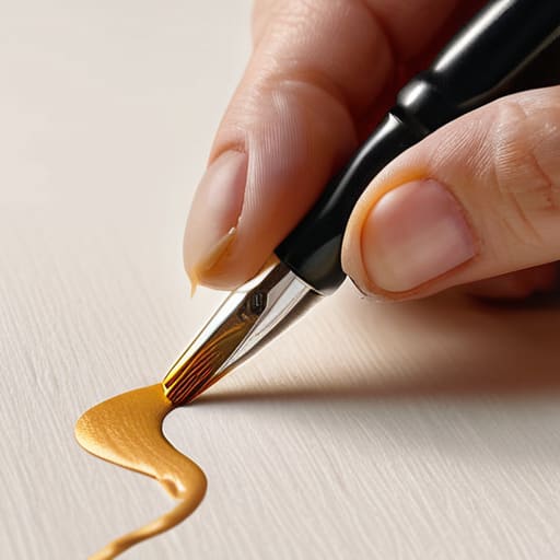
When we talk about modern script styles, there is a tendency to lean into the overly polished, the kind of “perfect” cursive that feels surgically applied to a digital canvas. But true script isn’t about achieving a flawless line; it’s about the rhythm of the stroke. If you are just starting out, I often suggest experimenting with brush lettering for beginners to understand how pressure dictates weight. It’s that physical push and pull—the way a nib bites into the paper—that creates a sense of movement. When you master that tension, the script stops looking like a decorative afterthought and starts feeling like a living, breathing element of the composition.
However, don’t let the lack of a professional brush stop your momentum. I’ve spent many afternoons in my studio using faux calligraphy methods to build out letterforms with a simple fine-liner. This approach forces you to slow down and actually observe the structural logic of each character. By manually adding weight to the downstrokes, you begin to internalize the foundational principles of how script actually functions. It’s a slower, more deliberate way to work, but that friction is exactly where the soul of the design is found.
Building Your Essential Lettering Tool Kit
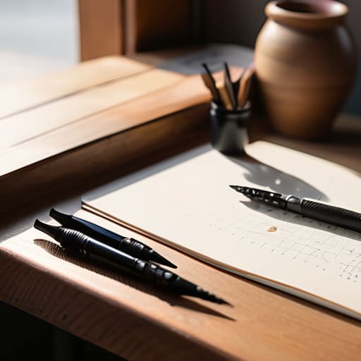
Before you dive into the nuance of stroke weight or rhythm, you need to curate your physical space. I’ve learned through years of shifting between tactile ink and digital vectors that your tools dictate your mindset. You don’t need a studio full of expensive equipment to start, but you do need items that allow for uninterrupted flow. For me, that means a heavy-weight sketchbook that won’t bleed and a set of varying nibs. If you are just starting out, don’t feel pressured to jump straight into professional brush pens; mastering brush lettering for beginners often starts with much simpler tools, like a standard felt-tip or even a pencil, to help you understand how pressure translates to line width.
As you build your lettering tool kit, remember that the goal isn’t just to collect gear, but to understand the mechanics of your medium. If you find yourself struggling with the fluidity of a real brush, experimenting with faux calligraphy methods using a fine-liner can be a brilliant way to internalize the logic of thick and thin strokes without the technical barrier of ink control. It’s about building that muscle memory first.
Finding the Soul in the Stroke
- Stop chasing perfection. In my years of type design, I’ve learned that the slight tremor in a line or a tiny ink bleed isn’t a mistake—it’s the “human trace” that prevents a design from feeling sterile and machine-made.
- Respect the rhythm of the letterform. Whether you’re working on a heavy block serif or a delicate monoline script, every style has a heartbeat; if you ignore the natural cadence of the strokes, the lettering will feel forced and disjointed.
- Match your style to the weight of the message. Don’t use a whimsical, bouncy script for a brand that needs to feel grounded and authoritative; the style must carry the emotional gravity of the words it’s forming.
- Study the anatomy of traditional calligraphy. Even when you’re working digitally, understanding how a physical nib interacts with paper will give your digital lettering a sense of structural integrity that “click-and-drag” styles often lack.
- Embrace intentional friction. Don’t be afraid to let your strokes overlap or vary in thickness; that resistance between the tool and the surface is exactly what gives a hand-lettered piece its tactile, lived-in quality.
The Intentionality of the Mark
Stop treating lettering as a mere decorative layer; every stroke should carry a specific weight and rhythm that serves the core message of your brand.
Embrace the imperfections—the slight wobble in a line or the unevenness of ink—as these are the very elements that breathe life and human connection into a digital space.
Prioritize the relationship between your tool and your hand, ensuring that the medium you choose actually enhances the tactile character of your design rather than flattening it.
The Weight of the Line
A hand-lettered stroke isn’t just a shape; it’s a record of a moment. When we choose a style, we aren’t just selecting a visual aesthetic—we are deciding how much of our own human friction we want to invite into the digital void.
Ingrid Bellamy
The Weight of the Mark
At the end of the day, mastering different hand lettering styles isn’t about accumulating a massive library of techniques or owning every high-end nib on the market. It is about understanding how a heavy, rhythmic serif communicates stability, or how a fluid, gestural script can evoke a sense of immediate, human connection. We’ve looked at the precision required for modern scripts and the foundational necessity of a well-curated toolkit, but the most important element remains your ability to choose the right tool for the right intention. Whether you are working digitally or with a physical fountain pen, every stroke should serve the underlying purpose of the design rather than just adding decorative noise to the page.
As we move further into an era of seamless automation, I find myself craving the small imperfections that only a human hand can produce. Don’t be afraid of the slight wobble in a line or the way ink bleeds into a specific paper grain; those are not mistakes, they are the fingerprints of your creativity. My advice is to step away from the perfection of the grid every once in a while. Pick up a pen, embrace the friction of the process, and remember that the most impactful designs are often the ones that feel most alive.
Frequently Asked Questions
How do I maintain a sense of visual hierarchy when mixing different lettering styles in a single layout?
The trick is to establish a clear “anchor” style. Don’t let every letterform fight for the spotlight; it creates visual noise that exhausts the eye. Pick one dominant style—perhaps a bold, structured serif or a heavy display face—to carry your primary information. Use your more expressive, fluid lettering as a secondary accent to guide the viewer’s gaze. If everything is shouting, nothing is being heard. Control the tension through scale and contrast.
Is it possible to capture the soul of a hand-drawn style in digital lettering without it feeling sterile or overly polished?
It’s the most common struggle in our current landscape. To avoid that sterile, “perfect” digital sheen, you have to stop fighting the imperfections. Don’t try to clean up every stray stroke or even out every baseline. Instead, lean into the slight tremors and the inconsistent pressure. It’s the “errors”—the way a line thins unexpectedly or a curve breaks—that signal a human was actually there. Respect the friction; that’s where the soul lives.
At what point does a lettering style stop feeling intentional and start looking like a gimmick?
It becomes a gimmick the moment the style starts dictating the message instead of supporting it. When you choose a high-contrast brush script just because it’s “on-trend,” but it obscures the legibility or clashes with the brand’s core values, you’ve lost the thread. Intentionality requires friction; it requires you to justify every stroke. If you can’t explain why that specific weight or texture serves the specific word you’re writing, you’re just decorating.
