
I remember sitting in a dimly lit studio back in the late nineties, the smell of spray mount and fresh ink heavy in the air, staring at a layout that felt technically perfect but emotionally hollow. We were obsessed with the “look,” but we had absolutely no idea what the words were actually doing on the page. Fast forward to today, and I see the same mistake happening in digital spaces—only now, it’s masked by flashy UI and complex animations. People treat content strategy for designers like it’s some high-level corporate jargon meant to justify massive budgets, when in reality, it’s just the disciplined practice of making sure your visuals have something meaningful to say.
I’m not here to sell you on a bloated, multi-step framework that requires a dozen spreadsheets and a week of meetings. Instead, I want to share the practical, grounded approach I’ve used to help agencies bridge the gap between aesthetic beauty and functional communication. We are going to strip away the hype and focus on how you can use content strategy for designers to build work that respects the user’s attention and honors the craft of intentional storytelling.
Table of Contents
Design Led Content Creation Respecting the Human Touch

We often treat content as a secondary layer—something to be “slotted in” once the grid is established. But when we approach it this way, we lose the soul of the work. I’ve found that the most impactful projects emerge from design-led content creation, where the narrative and the layout are developed in tandem rather than in isolation. It’s about understanding that a block of text isn’t just a placeholder; it is a rhythmic element that dictates the pacing of the user’s eye.
To do this well, we have to lean into design thinking in content strategy. This means moving beyond mere aesthetics to consider how information is actually digested. Are we providing a clear hierarchy, or are we just creating visual noise? When we integrate storytelling into the structural bones of a project, we respect the user’s cognitive load. We aren’t just filling a screen; we are building a deliberate, tactile experience that honors the intentionality of the craft.
Visual Storytelling Techniques That Empower the Creator

When we talk about visual storytelling techniques, we often get caught up in the pursuit of high-fidelity perfection. But true storytelling isn’t about the cleanest vector path; it’s about the narrative arc that exists between the elements. For me, this means using composition to guide the eye through a logical, almost tactile journey. Instead of treating images as mere decoration, I view them as anchors for the user’s attention. When you apply design thinking in content strategy, you stop asking “does this look good?” and start asking “does this movement make sense for the person on the other side of the screen?”
This shift requires a disciplined approach to how we layer information. We shouldn’t just stack assets; we should curate them to reflect a cohesive brand voice for creatives. I’ve found that the most impactful work often utilizes intentional white space to let the core message breathe, rather than crowding the frame with every available asset. By prioritizing the hierarchy of the story over the sheer volume of the content, we create a digital experience that feels less like an automated broadcast and more like a meaningful conversation.
Five Ways to Anchor Your Strategy in Intentionality
- Stop designing for the void. Before you even touch a grid, ask what the content is actually doing. If a piece of copy or an image doesn’t serve the user’s journey or the brand’s core truth, it’s just visual noise. Leave the white space empty rather than filling it with meaningless filler.
- Build systems, not just layouts. A true content strategy anticipates how a single idea evolves across different scales. Don’t just design a beautiful hero image; design the logic of how that visual language survives a mobile crop or a high-density text block.
- Respect the hierarchy of information. We often get so caught up in the aesthetics of a typeface that we forget its primary job: legibility. Your strategy should dictate the reading order, using scale and weight to guide the eye naturally, rather than forcing the user to hunt for meaning.
- Embrace the friction of context. Digital design can feel too seamless, almost frictionless, which often leads to mindless scrolling. Design content “moments” that demand a second of thought—use pacing and deliberate breaks to ensure the user actually absorbs the message instead of just gliding past it.
- Document the ‘Why’ alongside the ‘What’. A design spec tells a developer how big a button is, but a content strategy tells them why that button exists in that specific sequence. Keep a running log of your creative decisions; it bridges the gap between a pretty interface and a functional tool.
The Core Principles of Intentional Design
Stop treating content as a filler for empty containers; instead, let the narrative dictate the layout, ensuring every pixel serves a specific communicative purpose.
Prioritize the “friction” of human experience by creating digital paths that allow users to pause and absorb meaning rather than just scrolling through mindless noise.
Use your design authority to advocate for the creator, building systems that support thoughtful, manual craft rather than defaulting to the easiest, most automated solution.
The Trap of Empty Space
A content strategy isn’t a checklist of assets to populate a grid; it is the intentional architecture of meaning. If you are designing just to fill the void, you aren’t strategizing—you’re just decorating.
Ingrid Bellamy
Beyond the Pixels
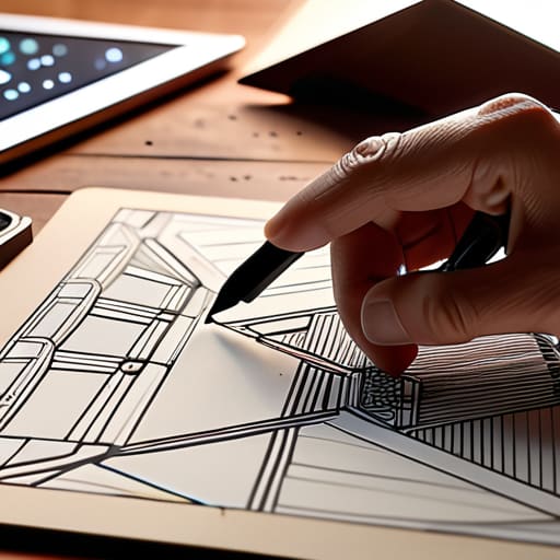
Ultimately, a successful content strategy for designers isn’t about finding the most efficient way to populate a grid; it’s about ensuring every element serves a deliberate purpose. We’ve explored how to bridge the gap between raw information and visual storytelling, moving away from mindless automation and toward a practice that respects the friction of human interaction. By prioritizing design-led creation and intentional visual hierarchies, you move past the role of a mere decorator and step into the role of a communicator. When we stop treating content as an afterthought and start treating it as the very foundation of our layouts, we create work that actually resonates with the person on the other side of the screen.
As you move forward with your next project, I encourage you to put down the mouse for a moment. Pick up that sketchbook, grab your pen, and ask yourself if the path you are building is actually worth walking. The digital landscape is increasingly crowded with noise and frictionless, mindless scrolling, but there is still a profound hunger for intentionality and craft. Don’t be afraid to slow down the process to ensure the result has soul. Our job isn’t just to fill screens; it is to build meaningful connections through the quiet, disciplined application of design.
Frequently Asked Questions
How do I balance the need for rapid, scalable digital content with the slow, intentional craftsmanship I value in my design work?
Build systems, not just assets. I approach this by designing robust, modular frameworks—think of it like creating a well-crafted typeface rather than a single character. When you establish clear typographic hierarchies and grid systems, you create a “sandbox” where rapid scaling can happen without losing soul. Use automation to handle the repetitive, heavy lifting, but always reserve the final, critical decisions for the human hand. Efficiency shouldn’t be the enemy of craft; it should be its scaffolding.
Where is the line between using automation to streamline my workflow and letting it erode the unique "human friction" that makes a brand feel real?
The line is drawn at intention. Use automation to handle the repetitive, soul-crushing tasks—the resizing, the file naming, the tedious grid adjustments. That’s just housekeeping. But the moment you let an algorithm decide the rhythm of a typeface or the emotional weight of a color palette, you’ve lost the plot. Automation should be your apprentice, handling the heavy lifting so you have more headspace to focus on the deliberate, imperfect nuances that actually make a brand feel alive.
How can I convince clients that a content strategy driven by intentionality is more valuable than one simply optimized for maximum screen time and engagement metrics?
Shift the conversation from attention to resonance. When a client asks for “engagement,” they’re usually asking for noise. I tell them that metrics measure how long someone stares, but intentionality measures how long they remember. Show them that chasing every algorithm change is a race to the bottom of a shallow pool. True brand value lives in the quality of the connection, not just the quantity of the clicks. Build something that lasts, not just something that scrolls.
