
I remember sitting in a cramped studio back in the late nineties, the air thick with the scent of spray mount adhesive and the rhythmic thwack of X-Acto blades hitting cutting mats. We didn’t have high-fidelity prototypes to hide behind; we had ink, paper, and the terrifyingly honest realization that if a layout didn’t work in black and white, no amount of expensive color grading would save it. Today, I see designers rushing into complex, high-fidelity mockups before they’ve even grasped the basics of effective wireframing, treating the process like a chore to be bypassed rather than the structural soul of the project.
I’m not here to teach you how to use the latest expensive plugin or how to make your gray boxes look “pretty.” Instead, I want to share what twenty years of shifting from physical paste-ups to digital interfaces has taught me about building with intention. We are going to strip away the digital noise and focus on how to use effective wireframing to respect the user’s journey and the inherent friction of human interaction. No fluff, no hype—just the foundational logic required to build tools that actually serve a purpose.
Table of Contents
- Honoring Information Architecture Over Decorative Noise
- Mastering User Interface Planning Through Human Friction
- Five Ways to Keep Your Wireframes Grounded in Reality
- The Core Principles of Intentional Wireframing
- ## The Purpose of the Skeleton
- The Intentional Path Forward
- Frequently Asked Questions
Honoring Information Architecture Over Decorative Noise
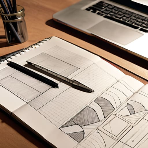
When I sit down with a fresh sketchbook, I try to strip away the temptation to make things look “pretty” too early. It’s easy to get distracted by color palettes or trendy shadows, but that’s just decorative noise. If your information architecture is broken, no amount of high-fidelity polish will save the experience. I’ve seen too many junior designers rush into high-fidelity layouts before they’ve actually mapped out the hierarchy of the content. They treat the screen like a canvas for decoration rather than a map for navigation.
Instead, focus on the bones. A solid user interface planning phase requires you to treat every element as a functional decision. Ask yourself: Does this heading actually guide the eye, or is it just taking up space? Does this grouping make sense for the user’s mental model? We need to prioritize the structural integrity of the layout over the aesthetic superficiality. When we respect the underlying logic of the data, we create digital products that feel intuitive rather than just visually loud.
Mastering User Interface Planning Through Human Friction

In my experience, we often mistake speed for efficiency. We rush into high-fidelity layouts because they feel more “finished,” but in doing so, we bypass the most critical stage of user interface planning: the moment where we actually sit with the logic of the interaction. I’ve seen too many teams jump straight from a rough sketch to a polished mockup, losing the structural integrity of the product in the process. When you bypass the friction of a low-fidelity wireframe, you aren’t just saving time; you are actively ignoring the structural bones that hold the experience together.
True mastery comes from embracing the awkward, unpolished stages of the prototyping workflow. It’s in these gray-scale, skeletal phases that you truly test your UX design principles. If a user can’t find their way through a series of simple boxes and lines, no amount of beautiful typography or subtle gradients will save the final product. We have to be willing to let the design feel “difficult” for a moment, forcing ourselves to solve the navigation and hierarchy before we ever touch a color palette. Respect the struggle of the layout before you attempt to beautify it.
Five Ways to Keep Your Wireframes Grounded in Reality
- Kill the color early. If you start playing with brand palettes before the structure is sound, you’re just decorating a house that hasn’t been framed yet. Stick to grayscale to ensure the hierarchy works without the crutch of aesthetic distraction.
- Design for the “clumsy” user. We often design for the perfect interaction, but real people have heavy thumbs and distracted minds. Build in enough breathing room—actual white space, not just empty pixels—to accommodate human error.
- Use real content, not just Lorem Ipsum. Nothing masks a broken layout like placeholder text. Using actual copy forces you to confront how much space a real headline takes up or how a long paragraph disrupts the visual rhythm.
- Prioritize the “Why” over the “Where.” It’s easy to get caught up in placing a button in the bottom right, but if you can’t explain the logic behind its placement in relation to the user’s goal, the placement is arbitrary.
- Respect the constraints of the medium. A wireframe shouldn’t just be a dreamscape; it needs to acknowledge the technical reality of the screen. Don’t design complex gestures that will feel unnatural or impossible on a standard mobile interface.
The Core Principles of Intentional Wireframing
Treat your wireframes as a structural blueprint rather than a visual placeholder; prioritize the logic of how information flows before you even think about color or typography.
Embrace “productive friction” by designing paths that reflect real-world human behavior, ensuring your layout guides the user through thought rather than just through clicks.
Resist the urge to polish too early; use the low-fidelity stage to ruthlessly test your architecture, keeping your focus on purpose and utility instead of aesthetic distractions.
## The Purpose of the Skeleton
A wireframe isn’t a placeholder for a pretty interface; it is the structural integrity of your idea. If the logic fails in black and white, no amount of color or high-fidelity polish will save the experience from feeling hollow.
Ingrid Bellamy
The Intentional Path Forward
At its core, effective wireframing isn’t about drawing boxes or deciding where a menu sits; it is about establishing a structural integrity that honors the user’s cognitive load. We have discussed the necessity of prioritizing information architecture over mere decorative noise and the vital importance of designing for human friction rather than mindless efficiency. When we strip away the colors and the high-fidelity distractions, we are left with the skeleton of the experience. If that skeleton is weak or poorly articulated, no amount of polished UI or clever micro-interactions will save the final product. We must ensure that every line we draw serves a functional purpose within the broader ecosystem of the user’s journey.
As you move from these low-fidelity sketches into the high-stakes world of digital production, I urge you to hold onto that sense of craftsmanship. It is easy to let the speed of modern software dictate your pace, but don’t lose sight of the intentionality that makes design meaningful. A wireframe is more than a blueprint; it is a commitment to a specific way of interacting with the world. Let your work be a bridge between technical capability and human need. Build with the same care I give to my vintage Leica—focusing on the mechanics that matter so that the final image, or in this case, the final interface, feels entirely inevitable.
Frequently Asked Questions
How do I know when a wireframe has enough detail to be useful without letting decorative impulses hijack the structural process?
Stop looking for “completeness” and start looking for clarity. A wireframe is finished when the logic is undeniable, not when the pixels look pretty. If you find yourself debating a corner radius or a specific shade of gray, you’ve crossed the line into decoration. Ask yourself: Does this element communicate a function, or am I just trying to soothe my own aesthetic anxiety? If the flow works without the polish, you’re ready to move on.
In an era of rapid prototyping, how can I maintain a sense of intentionality without slowing down the entire development cycle?
It’s a delicate balance. The temptation is to jump straight into Figma and start moving pixels, but that’s where intentionality goes to die. I find that the answer lies in “low-fidelity checkpoints.” Don’t skip the sketch. Spend fifteen minutes with your fountain pen mapping out the logic before you touch a mouse. By front-loading the thinking through analog sketching, you actually speed up development because you aren’t wasting time redesigning flawed logic later.
How do I effectively communicate the importance of "human friction" to stakeholders who are only focused on frictionless, high-speed user flows?
Stop selling them on “speed” and start talking about “meaningful engagement.” When stakeholders demand frictionless flows, they’re often just asking for a vacuum. I tell them that if a user breezes through a product without a single moment of pause, they aren’t experiencing the brand—they’re just consuming it. Explain that intentional friction is where decision-making happens. We aren’t building a slide; we’re building a workspace. Friction is where the human actually arrives.
