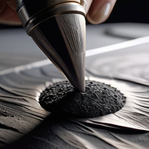
I remember sitting in a cramped studio back in the late nineties, my fingers stained with India ink and the smell of heavy cardstock thick in the air. There was a specific, stubborn resistance to the paper—a physical grit that told you exactly where a shadow should land. Today, I watch junior designers struggle with the same problem, only they’re staring at a sterile, backlit screen. They try to compensate for that lost soul by downloading massive, over-processed asset packs, but they end up with something that looks cheap and synthetic. They think they can solve the depth problem with sheer complexity, but they’re missing the point of shading with textures entirely. It isn’t about adding more layers; it’s about respecting the light.
I’m not here to sell you on a new plugin or a “secret” brush set that promises to do the thinking for you. Instead, I want to talk about how we can bring that sense of intentionality back into our digital workflows. I’m going to show you how to use grain, noise, and organic patterns to create depth that actually feels grounded in reality. We’re going to move past the superficial and learn how to build shadows that possess a sense of weight and purpose.
Table of Contents
Beyond Smooth Pixels Mastering Diffuse Texture Application
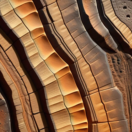
When we talk about diffuse texture application, I often see designers make the mistake of treating the surface like a flat sticker. They layer a high-resolution image over a plane and call it a day, but the result feels sterile—it lacks that vital sense of weight. To get it right, you have to think about how light actually interacts with the microscopic irregularities of a surface. It isn’t just about the color; it’s about how those colors break apart under different lighting conditions.
If you want to move past that “plastic” look, you need to consider how material properties in rendering dictate the soul of your design. I find that the most successful work happens when you stop treating texture as a decorative layer and start treating it as a structural one. This means integrating ambient occlusion and texture to ensure that the tiny crevices and valleys of your design catch the shadows naturally. Without that subtle interplay of light and dark in the recesses, your work will always feel like it’s floating on top of the screen rather than being part of it.
Simulating Reality Through Nuanced Normal Map Shading
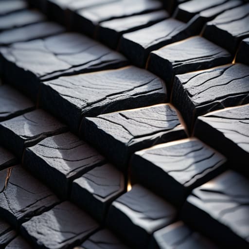
If diffuse textures provide the soul of a surface, then normal map shading provides its skeletal structure. When I’m working on a digital interface that needs to feel substantial—something that feels like it has weight rather than just being a flat arrangement of light—I lean heavily into how light interacts with perceived depth. It’s not about creating fake shadows; it’s about simulating how light grazes a microscopic ridge or dips into a grain. Without this, your design remains a ghost, floating aimlessly on the screen.
The trick is to avoid the “uncanny valley” of digital perfection. If you push your normal maps too hard, the surface starts to look like cheap plastic. I prefer to use them to subtly guide the eye, focusing on how specular highlights on surfaces catch the light only at specific angles. It’s that slight, intentional resistance to light that makes a digital object feel like it was actually made. By mastering these nuances, you move away from mere decoration and toward a sense of tangible presence.
The Craft of Imperfection: Five Rules for Tactile Shading
- Avoid the “perfect” gradient. In the physical world, light never hits a surface with mathematical precision. Introduce slight, organic irregularities in your shading to prevent that sterile, plastic look that plagues most digital interfaces.
- Respect the grain. Whether you’re simulating paper or brushed metal, the texture should dictate how the light behaves, not just sit on top of it. If the texture doesn’t interact with your light source, it’s just a sticker, not a material.
- Less is almost always more. It’s tempting to crank up the noise or bump the displacement to show off your technical skills, but true craftsmanship lies in restraint. If the viewer notices the texture before they notice the object, you’ve gone too far.
- Match the grit to the intent. A high-contrast, heavy grain might work for a brutalist brand identity, but it will feel jarring in a sophisticated UI. Choose your tactile elements based on the emotional weight of the design, not just what looks “cool.”
- Mind the scale. One of the quickest ways to break immersion is to use a texture pattern that is too large or too small for the perceived object. Always check how your shading scales when you move from a hero image down to a tiny icon; the “feel” must remain consistent.
The Intentionality of Imperfection
Stop treating texture as a decorative layer; use it as a functional tool to guide the eye and establish a sense of physical weight.
Avoid the trap of digital perfection by leaning into subtle irregularities—real-world materials have grit, and your design should reflect that resistance.
Always prioritize the “why” behind the grain; if a texture doesn’t serve the brand’s narrative or the user’s tactile understanding, leave it out.
The Soul in the Surface
Digital perfection is a sterile lie. If you want a design to actually breathe, you have to stop chasing the flawless gradient and start embracing the subtle, imperfect grit that tells the eye a surface has a history.
Ingrid Bellamy
Finding the Soul in the Surface
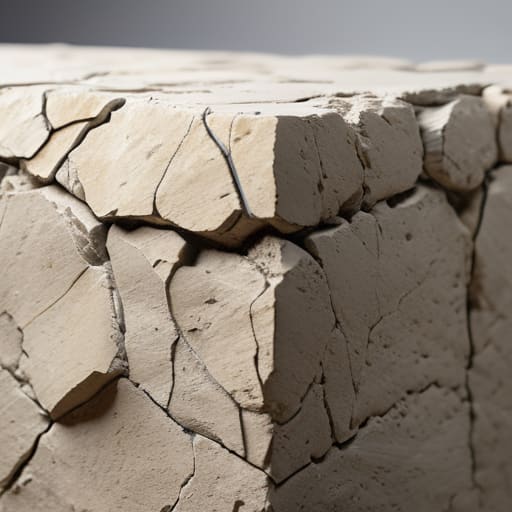
At the end of the day, mastering texture isn’t about adding more layers or chasing complex math; it’s about understanding how light interacts with the world we actually live in. We’ve looked at how diffuse maps set the foundation and how normal maps provide that essential, tactile depth that breaks up the sterile perfection of a digital render. Whether you are working with the subtle grain of heavy-weight paper or the rugged, uneven surface of weathered stone, the goal remains the same: to move away from the “too perfect” and toward something that feels lived-in. When we balance these elements correctly, we stop just decorating a screen and start building a sense of presence.
As you head back to your workstation, I encourage you to step away from the zoom tool for a moment. Look at the objects on your desk—the way a shadow catches the edge of a ceramic mug or how light scatters across a matte finish. Our digital tools are incredibly powerful, but they can easily become a crutch for laziness if we aren’t careful. Use them to recreate the friction of reality, not to bypass it. True craftsmanship in the digital age lies in our ability to honor those small, imperfect details that remind us a human hand was behind the design.
Frequently Asked Questions
How do I balance adding tactile texture without making the digital interface feel cluttered or visually noisy?
The trick is to treat texture like a seasoning, not the main course. If every surface is fighting for attention, you’ve lost the hierarchy. I always tell my clients to look for “micro-textures”—subtle grain or paper tooth that only reveals itself when someone actually looks closely. It provides that essential friction without creating visual static. If the texture makes the user work harder to find the call-to-action, you’ve gone too far.
At what point does adding grit and grain cross the line from "intentional craftsmanship" to just being a distraction?
It crosses the line the moment the texture starts competing with the hierarchy. If I’m looking at your typography and my eyes are fighting through a layer of digital noise just to read the kerning, you’ve failed. Texture should feel like a subtle foundation—the grain of the paper or the tooth of the canvas—not a heavy veil. If the grit obscures the intent, it isn’t craftsmanship; it’s just visual clutter.
How can I ensure these textured layers don't compromise the accessibility or legibility of my typography?
This is where the tension between aesthetics and utility gets real. I always tell my clients: texture should provide depth, not distraction. If your typeface starts fighting with the grain of your background, you’ve lost the battle. Keep your text layers on a clean, solid, or minimally textured substrate. Think of the texture as the atmosphere, but the typography as the signal. If the grit obscures the letterforms, dial back the opacity or increase the contrast.
