I remember sitting in a cramped studio back at RISD, the air thick with the scent of rubber cement and the rhythmic thwack of X-Acto blades hitting cutting mats. We didn’t have endless digital libraries then; we had physical lead type and the terrifying responsibility of making every single character count. Today, I see designers scrolling through thousands of font files, throwing combinations together like they’re playing a slot machine, hoping for a win. But true typeface pairing isn’t about finding two fonts that “look cool” together; it’s about understanding the silent conversation happening between the strokes of a serif and the geometry of a sans.
I’m not here to give you a list of “top 10” trends that will be obsolete by next Tuesday. Instead, I want to share the principles of intentionality that I’ve gathered from twenty years of moving from paste-ups to pixels. I promise to walk you through a framework for selecting typefaces that respect the rhythm of the page and the patience of the reader. We are going to move past the superficiality of “matching” and start focusing on building visual hierarchy that actually serves a purpose.
Table of Contents
Mastering Serif and Sans Serif Combinations
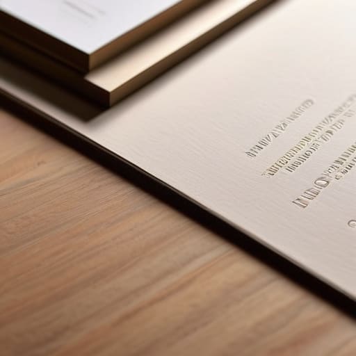
The most common way to create a sense of structure is through the tension between serif and sans serif combinations. I’ve always found that this pairing works because it mirrors the way we naturally process information: the sans serif provides a clean, structural framework, while the serif offers the warmth and character that guides the eye through a narrative. But the trick isn’t just picking two different styles; it’s about managing the rhythm of the reading experience. If the weights are too similar, they’ll fight for attention, creating a visual hum that distracts the reader rather than settling them into the text.
To get this right, you have to lean into font weight contrast. I often suggest using a heavy, geometric sans serif for headers to establish a clear anchor, then pairing it with a more delicate, transitional serif for the body copy. This approach respects fundamental typographic hierarchy principles by making the relationship between information levels immediate and intuitive. It’s about finding that sweet spot where the two faces don’t just coexist, but actually amplify one another through their differences.
Achieving Visual Balance in Typography
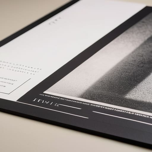
When we talk about visual balance in typography, we aren’t just talking about centering a heading or justifying a block of text. It’s about the invisible tension between the shapes on the screen. I often think of it like adjusting the aperture on one of my old Leica cameras; if the contrast is too harsh, you lose the soul of the image, but if it’s too soft, nothing holds the eye. In design, this tension is managed through font weight contrast. If your headline is a heavy, unapologetic grotesque, your body copy needs enough breathing room and a lighter stroke to prevent the layout from feeling claustrophobic.
True equilibrium comes from respecting the white space as much as the letterforms themselves. You can’t achieve a sophisticated layout by simply following a checklist of typographic hierarchy principles; you have to feel the rhythm. It’s about ensuring that no single element screams so loudly that it drowns out the nuance of the rest. When you find that sweet spot—where the heavy weights anchor the page and the lighter strokes provide the flow—you create a sense of effortless stability that allows the reader to focus on the message, not the mechanics.
Five Principles for Intentional Pairing
- Define the hierarchy before you touch the keyboard. Before you even look at a specimen sheet, decide what needs to command attention and what needs to recede. If everything is shouting, nothing is being heard; use scale and weight to guide the eye, not just to fill the layout.
- Respect the “personality” of the stroke. I’ve seen too many designers pair a rigid, geometric sans-serif with a whimsical, high-contrast serif only to have them clash like bad radio interference. Look for a shared DNA—perhaps a similar x-height or a common terminal style—to create a sense of quiet cohesion.
- Embrace the tension of contrast. Don’t be afraid of opposites, but ensure they are purposeful. A heavy, brutalist headline paired with a delicate, airy body face can create a beautiful tension, provided there is enough breathing room between them to let the relationship breathe.
- Test for legibility in the “messy” middle. A typeface might look stunning in a high-resolution specimen book, but does it hold up in a cramped sidebar or on a low-brightness mobile screen? If the pairing fails the test of utility, it isn’t good design; it’s just decoration.
- Limit your palette to maintain focus. It is tempting to pull from every foundry’s latest release, but a design with three or four competing typefaces is a design in chaos. Stick to two, maybe three, distinct families. Let the nuances of weight and spacing do the heavy lifting instead of adding more noise.
The Intentionality of Choice
Stop treating typeface pairing like a math problem to be solved; instead, treat it like a conversation where each font needs to know when to speak and when to listen.
Prioritize legibility over novelty, ensuring that your typographic choices respect the reader’s cognitive load rather than just demanding their attention.
Build your pairings around the specific rhythm of the content, allowing the white space and the weight of the strokes to create a natural, human flow.
The Rhythm of the Page
Typeface pairing isn’t about finding two fonts that look nice together; it’s about creating a conversation between two distinct voices that, when spoken in unison, respect the reader’s need for both clarity and character.
Ingrid Bellamy
The Intentionality of Choice
At the end of the day, pairing typefaces isn’t about following a checklist or finding a mathematical formula that guarantees success. It is about understanding the tension between different voices on a page. We have looked at how to bridge the gap between serifs and sans serifs, and how to maintain a sense of visual equilibrium so the reader never feels lost. Whether you are leaning into high contrast for drama or seeking a subtle, monochromatic harmony, remember that every choice you make dictates the rhythm of the experience. Good typography shouldn’t just look right; it should feel right in the hands of the person consuming the content.
As we move further into an age where algorithms can suggest pairings with a single click, I urge you to resist the urge to outsource your intuition. There is a specific, quiet magic in the friction of a manual decision—the moment you decide that a particular weight of a typeface provides exactly the human warmth a brand needs. Don’t let the tools do the thinking for you. Instead, use them to amplify your own perspective. Treat your type scales like a well-worn sketchbook: let them be thoughtful, let them be deliberate, and above all, let them serve the story.
Frequently Asked Questions
How do I know when a typeface pairing has become too busy or distracting for the reader?
You’ll know you’ve crossed the line when you stop seeing the words and start seeing the “noise.” If your eyes are jumping between different weights, x-heights, or personality quirks instead of flowing through the sentence, the hierarchy has collapsed. A good pairing should feel like a conversation between two distinct voices, not a shouting match. If you have to squint or pause to parse the structure, strip it back. Trust the silence of white space.
Is it better to find two fonts that are nearly identical to create subtle contrast, or should I look for something more radical?
It’s tempting to go for the “near-miss”—two fonts that are almost identical—but that often results in visual tension rather than harmony. It feels like a mistake rather than a choice. I prefer leaning into intentionality. If you want subtlety, find two different typefaces that share a common DNA, like an x-height or a similar stroke weight. If you want impact, go radical. Just make sure the contrast serves a purpose; don’t let it just be noise.
When am I working with limited space, how do I prioritize which typeface takes the lead in the visual hierarchy?
When space is tight, stop trying to make every character fight for attention. It’s a zero-sum game. I always look for the “anchor”—the typeface that carries the soul of the brand. If you’re designing a dense interface, let a clean, high-legibility sans-serif handle the heavy lifting of the data, and use your more expressive face sparingly for the headers. Give the reader a place to rest; hierarchy is as much about whitespace as it is about type.
