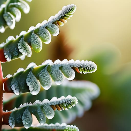
I was sitting at my drafting table last Tuesday, cleaning the grit out of a 1970s Leica lens, when I realized how much we’ve lost in our rush to make everything “perfectly” digital. We’ve become obsessed with sterile, mathematical precision, treating design like a math problem to be solved rather than a living thing to be felt. I see it everywhere in modern UI: these lifeless, hyper-symmetrical grids that feel more like a hospital corridor than a human space. We talk about incorporating natural patterns to add “warmth,” but most designers just slap a generic leaf vector on a landing page and call it a day. That isn’t design; it’s decoration, and it’s an insult to the complexity of the real world.
I’m not here to give you a lecture on biomimicry or show you a slideshow of pretty fractals. Instead, I want to talk about how we can actually use the unpredictable rhythm of the organic world to create digital interfaces that feel intuitive and grounded. We are going to look at how to weave true natural patterns into your workflow—not as a stylistic gimmick, but as a way to respect the way humans actually perceive space and movement. This is about bringing back the intentionality of craft in a world that is increasingly obsessed with the shortcut.
Table of Contents
The Quiet Power of Fibonacci Sequence in Plants
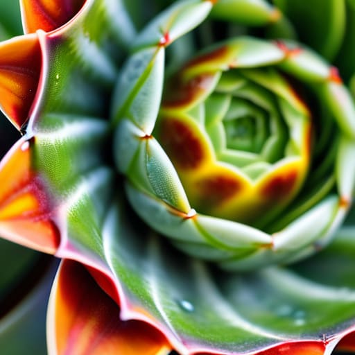
I often find myself sketching the spiral of a succulent or the arrangement of pinecone scales when I’m stuck on a layout. There is a profound, almost meditative logic to it. We talk a lot about “organic” design in our industry, but we rarely talk about the math that actually drives it. When you look closely at the fibonacci sequence in plants, you aren’t just seeing a pretty arrangement; you are seeing an incredibly efficient solution to the problem of space and light.
In my work, I try to translate this into digital interfaces. It isn’t about copying a leaf, but about understanding how mathematical patterns in biology create a sense of inevitable balance. When we implement these ratios into our grids or typographic scales, we move away from the sterile, “perfect” alignment that often makes digital work feel soulless. Instead, we tap into a rhythm that the human eye is already hardwired to recognize and trust. It’s that subtle tension between precision and growth that makes a design feel truly alive.
Finding Purpose in Biomorphic Design Principles
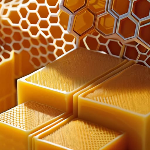
When we talk about biomorphic design principles, we aren’t talking about slapping a leaf icon on a landing page and calling it a day. That’s just decoration, and frankly, it’s lazy. True biomorphism is about understanding the underlying logic of how life organizes itself. It’s about recognizing that the efficiency found in tessellation in natural structures—like the way a honeycomb manages space—can inform how we layer information in a complex interface. When we mimic these biological efficiencies, we aren’t just chasing a trend; we are tapping into a visual language that the human brain is already hardwired to interpret as stable and coherent.
The goal is to move beyond mere “nature-inspired aesthetics” and toward a functional mimicry of growth and rhythm. Think about the way a branch splits or how a shell curves; there is a sense of inevitable logic in those forms. In my work, I try to translate that sense of inevitability into digital layouts. If a grid feels too rigid, it feels clinical and dead. By introducing subtle, organic deviations, we create a sense of movement that feels less like a machine and more like a living system.
Bringing the Human Element Back to the Grid
- Stop chasing perfect symmetry. Nature rarely works in mirrored perfection; it works in balance. Instead of forcing every element into a rigid, mathematical center, allow for slight, intentional asymmetries that mimic the way a leaf grows or a coastline curves. It creates a visual rhythm that feels lived-in rather than manufactured.
- Use organic tension to guide the eye. In the wild, patterns aren’t just decorations; they are pathways for survival. In your layouts, use the flow of natural curves to direct a user’s attention toward a call to action, much like the way sunlight filters through a canopy to highlight a specific patch of forest floor.
- Embrace the beauty of imperfection. Digital design tends toward the sterile, but true craftsmanship lives in the “errors.” Incorporate subtle, non-repeating textures or slightly irregular line weights. If every stroke is mathematically identical, you lose that essential friction that makes a design feel tactile and real.
- Respect the hierarchy of growth. Just as a tree grows from a central trunk outward into delicate branches, your design should have a clear, organic hierarchy. Don’t just scale elements up or down; let your typography and imagery evolve from a core concept, creating a sense of structural logic that feels intuitive to the viewer.
- Avoid the “sticker” trap. There is a massive difference between designing with natural patterns and simply slapping a botanical illustration onto a white background. If you use organic shapes, they must be integrated into the very architecture of the interface—the margins, the containers, and the transitions—not just treated as an afterthought.
Moving Beyond Ornamentation
Stop using organic shapes as mere decoration; use the underlying logic of natural patterns to create intuitive hierarchies that feel earned rather than forced.
Respect the “human friction” by designing interfaces that mimic the rhythmic, non-linear way we interact with the physical world, rather than striving for a sterile, frictionless perfection.
Let mathematical naturalism, like the Golden Ratio, act as a structural foundation for your grids to ensure your layouts possess an inherent, quiet stability that the eye recognizes instantly.
## The Friction of the Organic
We often mistake digital perfection for good design, but nature isn’t perfect—it’s intentional. When we integrate natural patterns into our work, we aren’t just adding decoration; we are reintroducing the subtle, rhythmic friction that makes a digital space feel lived-in and human.
Ingrid Bellamy
The Intentional Return
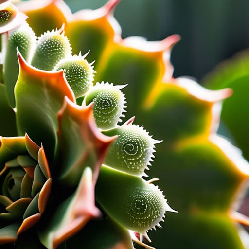
We’ve looked at how the Fibonacci sequence provides a hidden architecture to the natural world and how biomorphic principles can breathe life into static interfaces. But the takeaway isn’t that we should simply mimic the shape of a leaf or the curve of a shell to satisfy a trend. It is about recognizing that nature has already solved the problem of efficient, beautiful complexity. When we integrate these patterns, we aren’t just decorating a layout; we are tapping into a fundamental logic that the human eye is already evolved to trust. By moving away from the sterile, perfectly geometric grids that often dominate our digital spaces, we allow for a sense of rhythmic cohesion that feels less like an algorithm and more like an ecosystem.
As I sit here with my sketchbook, watching the way light hits the grain of my wooden desk, I am reminded that our best work often happens when we stop fighting against the “messiness” of life and start designing with it. Technology should never be a barrier between the creator and the soul of the work; it should be the lens that brings our intent into sharper focus. Let’s stop striving for a digital perfection that feels hollow and instead aim for a meaningful resonance. When we design with the patterns of the natural world in mind, we create digital experiences that don’t just occupy space, but actually respect the human spirit.
Frequently Asked Questions
How do I integrate these organic patterns without making the interface feel cluttered or distracting from the core functionality?
The mistake most designers make is treating organic patterns as decoration rather than structure. If you’re layering a Fibonacci spiral or a cellular texture, it shouldn’t sit on top of your UI like a sticker; it should dictate the rhythm of your spacing and the flow of your hierarchy. Use these patterns to inform your grid or your white space. If the pattern isn’t actively guiding the eye toward your CTA, it’s just noise. Keep it structural, not ornamental.
Is there a way to use mathematical patterns like the Golden Ratio to improve typography and layout hierarchy rather than just using them for decoration?
Stop treating the Golden Ratio like a decorative sticker you slap onto a composition. It’s a structural tool, not an ornament. I use it to establish a rhythmic scale between my body copy and headings, ensuring the visual weight feels earned rather than arbitrary. When you apply these proportions to your grid systems and typographic hierarchies, you aren’t just making things “look right”—you’re creating a logical, intuitive flow that respects how the eye naturally scans a page.
Where is the line between intentional biomorphic design and just adding "nature-inspired" fluff that lacks real structural purpose?
The line is drawn at utility. If you’re adding a leaf motif just to soften a sterile interface, you’re just decorating, not designing. Real biomorphic design uses organic logic to solve a problem—like using the branching patterns of a river delta to map a complex information hierarchy. If the shape doesn’t improve navigation, legibility, or the user’s sense of flow, it’s just digital clutter. Don’t mistake aesthetic mimicry for structural integrity.
