
I was sitting at my desk last night, cleaning the internal gears of a 1970s Leica, when I realized how much we’ve lost in the transition to the glass slab. There is a specific, heavy click when a manual shutter engages—a tactile confirmation that the world has been captured. Compare that to the sterile, frictionless swipe of a modern interface, and you’ll see why so much digital work feels hollow. We talk about sensory design as if it’s a luxury feature or a collection of flashy animations, but that’s a lie. Real sensory design isn’t about adding “flair” to a UI; it’s about reclaiming the intentionality of touch in a medium that feels increasingly ghostly and detached.
I’m not here to sell you on more haptic buzzes or neon gradients that serve no purpose other than to grab attention. Instead, I want to walk you through how we can build digital environments that respect the human experience. We are going to move past the superficial hype and look at how rhythm, weight, and subtle resistance can create a sense of meaningful presence. I’ll share what I’ve learned from decades of moving between physical ink and digital pixels, focusing on how to design with purposeful friction.
Table of Contents
The Weight of Interaction Haptic Feedback in Product Design
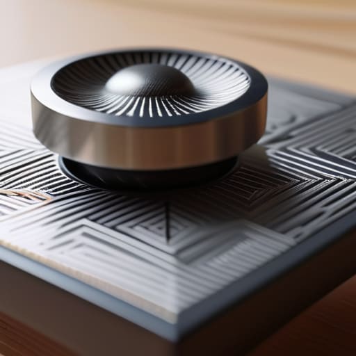
When I’m working on a new typeface, I think about the physical resistance of a pen against heavy-weight paper. That tiny bit of pushback is what makes the act of creation feel real. We’ve lost so much of that in the digital realm, where everything feels eerily frictionless and weightless. This is where haptic feedback in product design becomes vital. It isn’t about adding unnecessary buzzes or vibrations; it’s about providing a digital equivalent to the “click” of a well-made Leica shutter or the heavy turn of a volume knob.
If we want to move away from sterile, glass-slab interfaces, we have to design with intention. When a user interacts with a digital element, there should be a subtle, tactile response that confirms their action. By integrating these micro-interactions, we tap into neuroaesthetic design principles that make a device feel less like a cold machine and more like a crafted tool. We aren’t just moving pixels; we are trying to simulate the gravity and texture of the physical world to ground the user in the moment.
Neuroaesthetic Design Principles for Meaningful Digital Spaces
When we talk about neuroaesthetics, we aren’t just discussing how something looks; we are discussing how a digital interface resonates with the brain’s innate desire for order and beauty. In my years of type design, I’ve learned that the human eye seeks a specific kind of rhythm—a balance between complexity and clarity. By applying neuroaesthetic design principles, we can move beyond mere usability and begin to cultivate spaces that actually lower cognitive load. It’s about creating a sense of “visual ease” that feels less like a task and more like a natural extension of thought.
This isn’t about decorating a screen with pretty gradients; it’s about understanding the biological response to symmetry, proportion, and even the subtle tension of white space. We should look toward sensory design in architecture for inspiration here. Just as a well-designed room uses light and shadow to guide a person’s movement, a digital environment should use visual hierarchy to guide the mind. When we respect these deep-seated neurological patterns, we create digital tools that feel inherently right, fostering a sense of calm rather than the frantic, dopamine-chasing clutter we see everywhere else.
Five Ways to Bring Intentionality Back to the Interface
- Respect the rhythm of the user. Avoid the temptation to make every interaction instant and hyper-responsive; sometimes, a slight, intentional delay or a weighted animation can provide the necessary “gravity” that makes a digital action feel consequential.
- Design for cognitive ease, not just visual stimulation. Use white space and typographic hierarchy to create a sense of “breath” within your layouts, allowing the eye to rest rather than forcing it to scan a cluttered, high-decibel interface.
- Prioritize micro-textures over flat perfection. Even in a digital space, subtle gradients or grain can mimic the tactile familiarity of physical media, grounding the user in a way that sterile, mathematically perfect vectors never will.
- Audit your soundscapes for utility, not just flair. If you use audio cues, ensure they serve a functional purpose—like a soft, low-frequency click to confirm a successful task—rather than acting as digital clutter that breaks a user’s flow.
- Build for the “human friction” of error. Instead of harsh, jarring error states, design corrective feedback that feels like a gentle nudge, maintaining the user’s sense of agency rather than making them feel punished by the machine.
The Intentionality of the Interface
Move beyond visual polish; true sensory design requires a rhythmic balance of haptic feedback and neuroaesthetic principles that mimic the natural friction of the physical world.
Stop designing for passive consumption and start designing for active engagement by respecting the cognitive load and sensory expectations of the human user.
Use sensory cues not as decorative flourishes, but as functional anchors that guide the user through a digital space with the same intuition they would use when handling a vintage Leica.
## The Ghost in the Machine
We’ve become so obsessed with making interfaces seamless that we’ve accidentally stripped them of their soul. True sensory design isn’t about removing friction; it’s about introducing the right kind of resistance—the digital equivalent of a heavy paper stock or the satisfying click of a mechanical shutter—so the user actually feels the intention behind the interaction.
Ingrid Bellamy
Beyond the Pixel
We’ve looked at how haptic feedback provides the physical weight necessary for digital confidence and how neuroaesthetics can ground a user in a space that feels intuitively “right.” Sensory design isn’t about adding decorative layers or flashy animations to fill a void; it is about bridging the gap between the cold efficiency of a processor and the warmth of human perception. When we integrate rhythm, texture, and tactile feedback, we aren’t just optimizing a user interface—we are honoring the biological reality of the person on the other side of the glass.
As we move further into an era of increasingly seamless, automated experiences, my fear is that we will lose the very friction that makes design feel human. I don’t want a digital world that is so smooth it becomes frictionless and forgettable. I want tools that demand a certain level of presence, much like the mechanical click of a Leica or the drag of a fountain pen across heavy paper. Let’s commit to building digital environments that don’t just occupy our attention, but respect our senses. We must design with the intention to leave a mark, ensuring that even in a virtual space, the human touch remains felt.
Frequently Asked Questions
How do we implement sensory design without it becoming a distracting gimmick that breaks the user's flow?
The trick is to treat sensory cues like a well-designed typeface: they should support the legibility of the experience, not compete with it. If a haptic pulse or a subtle sound effect doesn’t serve a functional purpose—like confirming a delicate action or signaling a shift in hierarchy—it’s just noise. I always ask myself: does this element reduce cognitive load, or am I just adding decoration? If it breaks the rhythm, strip it back.
Is there a way to balance these tactile digital experiences with the need for strict accessibility standards, especially for users with sensory sensitivities?
It’s a delicate tension, isn’t it? We want texture, but we can’t create noise. I approach this by designing for “sensory agency.” Instead of forcing a haptic pulse or a specific visual rhythm on everyone, we build controls that let the user dial the intensity up or down. Accessibility isn’t a constraint to design around; it’s the framework that ensures our craftsmanship remains inclusive rather than overwhelming. Respect the user’s threshold.
As we move further into AI-driven interfaces, how can designers ensure that "sensory intent" isn't lost to automated, generic patterns?
We have to stop treating AI as a replacement for intuition and start using it as a high-fidelity brush. The danger isn’t the tool; it’s the temptation to let the algorithm smooth out all the meaningful “grit.” To keep sensory intent alive, we must intentionally inject intentional imperfection—variable rhythms, organic textures, and micro-interactions that don’t follow a mathematical average. Design with a specific human friction in mind, or you’ll just be producing digital wallpaper.
