I was hunched over my drafting table at RISD, the smell of spray mount and heavy cardstock thick in the air, trying to replicate the subtle grit of a letterpress print by hand. There was a certain physicality to the errors—the way ink pooled slightly too heavily in the wells of a typeface or how a paper grain broke the line of a stroke. Fast forward to today, and I see so many designers trying to replicate that soul by simply dragging a “grain” overlay onto a vector shape. It feels hollow. Most approaches to digital texture creation today are just layers of mathematical noise that lack any sense of weight or history; they are decorations, not craft.
I’m not here to sell you on a new plugin or a subscription to a library of generic grit. Instead, I want to talk about how we can actually inject intention back into our pixels. I’m going to share what I’ve learned about building textures that respect the friction of the human touch, moving past the superficial filters to create something that feels lived-in. We’re going to explore how to bridge that gap between the sterile screen and the tactile world we actually inhabit.
Table of Contents
- Adding Grit to Digital Painting for Human Connection
- Mastering Procreate Texture Brushes to Reclaim Tactile Friction
- Five ways to stop designing for machines and start designing for hands
- The Intentionality of Imperfection
- The Soul in the Static
- Finding the Soul in the Machine
- Frequently Asked Questions
Adding Grit to Digital Painting for Human Connection
When I sit down with my tablet, I often find myself fighting the inherent “perfection” of the stylus. Digital surfaces are, by nature, too clean; they lack the resistance of heavy-tooth paper or the unpredictable drag of charcoal. To counter this, I’ve started leaning more heavily into adding grit to digital painting as a deliberate structural choice rather than an afterthought. It isn’t about making something look “old”—it’s about introducing a sense of weight. I often experiment with custom procreate texture brushes to break up those unnervingly smooth gradients that tend to plague digital illustrations.
The goal is to create a visual language that acknowledges the medium’s limitations. Instead of relying on a single, heavy-handed layer, I prefer to build complexity through subtle, iterative steps. Sometimes, a well-placed set of photoshop texture overlays can mimic the slight imperfections of a physical print, giving the work a sense of permanence. It’s that slight friction of the surface that ultimately bridges the gap between a sterile vector and a piece of art that feels like it was actually made by a person.
Mastering Procreate Texture Brushes to Reclaim Tactile Friction
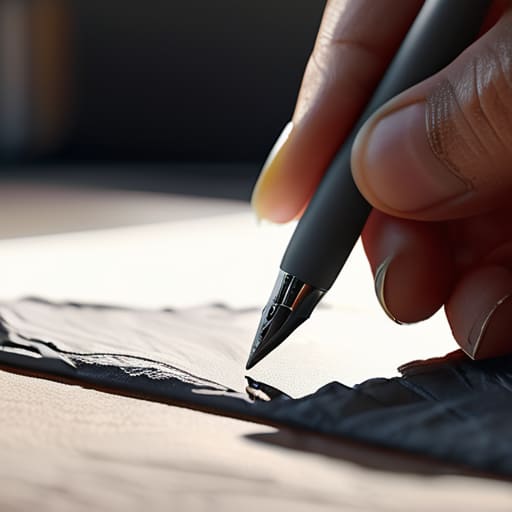
When I sit down with my iPad, I often find myself fighting the inherent “perfection” of the glass surface. It’s too smooth, too predictable. To counter this, I’ve spent a lot of time experimenting with procreate texture brushes that mimic the resistance of heavy-tooth paper or even the uneven drag of charcoal on linen. The goal isn’t to create a mess, but to introduce a controlled level of imperfection. I don’t look for brushes that do the work for me; I look for those that respond to the pressure and velocity of my hand, much like the vintage Leica I spent all weekend cleaning.
The secret lies in how you layer these effects. Instead of relying on a single, heavy-handed stroke, I prefer to build up digital art surface effects in thin, translucent passes. It’s a bit like working with watercolor glazes—you have to respect the build-up. By layering subtle grain over your base colors, you break up the digital gradient and give the eye something to catch on. It’s that slight visual “noise” that makes a piece feel like it exists in a physical space rather than just floating in a vacuum of pixels.
Five ways to stop designing for machines and start designing for hands
- Stop looking for the “perfect” preset. The most interesting textures come from layering imperfections—a bit of grain here, a slight color bleed there—rather than relying on a single, heavy-handed filter that flattens your work.
- Respect the light. In the physical world, texture is defined by how light hits a surface. When you’re working digitally, don’t just add noise; think about how your texture would catch a shadow or a highlight to give it actual depth.
- Use high-resolution scans of real materials. If you want a paper grain that feels authentic, don’t use a synthetic brush. Scan a piece of heavy-weight watercolor paper or an old linen swatch. That organic unpredictability is something an algorithm can’t truly replicate.
- Embrace the “mistake.” In my sketchbook, a stray ink blot or a shaky line adds character. In your digital workflow, leave those tiny inconsistencies in. If everything is mathematically precise, the eye immediately recognizes it as sterile and lifeless.
- Mind the scale. Texture should be felt, not just seen. If your grain is so loud it distracts from the typography, it’s no longer a texture—it’s a distraction. The best digital grit should sit quietly in the background, providing a sense of weight without screaming for attention.
The Intentionality of Imperfection
Stop chasing pixel-perfect smoothness; true digital craftsmanship lies in the controlled application of grit that mimics the resistance of physical media.
Use texture as a functional layer of depth rather than a decorative afterthought to give your digital interfaces a sense of weight and history.
Prioritize tools and brushes that allow for human error, ensuring your work retains the soul of a hand-drawn process rather than the sterile output of an algorithm.
The Soul in the Static
“A perfectly smooth vector is a lie; it ignores the way light hits a grain of paper or how ink bleeds into a fiber. If we want our digital work to actually resonate, we have to stop chasing sterile perfection and start designing for the beautiful, messy friction of the real world.”
Ingrid Bellamy
Finding the Soul in the Machine
We’ve spent a lot of time looking at the mechanics of this—how to layer grit into a digital painting or how to manipulate a Procreate brush to mimic the resistance of a physical medium. But at its core, digital texture creation isn’t about making things look “old” or “distressed” for the sake of a trend. It’s about intentionality. Whether you are building custom grain or carefully selecting a brush that mimics the drag of charcoal, you are essentially trying to bridge the gap between a sterile pixel and a meaningful experience. By integrating these elements, you move away from the hollow perfection of default settings and toward a design language that actually respects the viewer’s senses.
As I sit here with my sketchbook, watching the light shift across my desk, I’m reminded that the most beautiful things in life are rarely seamless. They have edges, imperfections, and a certain weight that tells a story of how they came to be. As you head back to your tablet or your workstation, don’t be afraid of the mess. Don’t fear the “noise” that breaks a perfect gradient. Instead, lean into that friction. Our goal shouldn’t be to simulate reality, but to infuse our digital tools with the same soul that we find in the physical world. Build something that feels like it was made by a hand, not just a processor.
Frequently Asked Questions
How do I balance adding texture without making the interface feel cluttered or visually "noisy"?
It’s a delicate tightrope. I always tell my clients: texture should be a whisper, not a shout. Think of it like the grain in a film photograph—it shouldn’t distract from the subject; it should ground it. Use texture to define edges or add depth to negative space, rather than coating every surface. If you find yourself squinting to read the copy, you’ve gone too far. Less is almost always more.
Is there a way to maintain consistent grain across different screen resolutions and device types?
The short answer is: it’s a constant battle against pixel density. To keep that grain from turning into a muddy mess or disappearing on a Retina display, stop relying on fixed pixel patterns. Instead, use procedural noise or high-resolution tiling textures that scale mathematically. I prefer working with SVG filters or grain overlays that respond to the viewport. You want texture that feels like a physical substance, not just a static layer of dots.
How can I incorporate these tactile elements into a brand identity without losing its professional, minimalist edge?
It’s a delicate balance, isn’t it? I always tell my clients: don’t let the texture become the subject. Treat grit like a seasoning, not the main course. Use it sparingly—perhaps on a single brand mark or a subtle paper grain in your brand guidelines. If you apply it to everything, you lose the clarity that minimalism demands. Keep your layouts clean and your typography sharp; let the texture provide the soul, not the noise.
