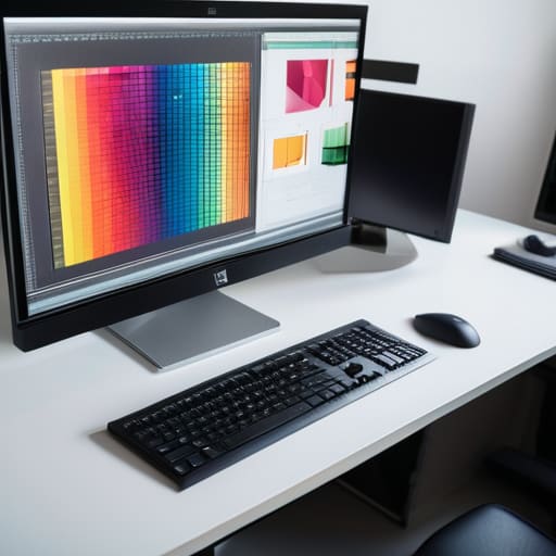
I can still smell the sharp, chemical tang of the darkroom and the heavy scent of fresh ink from the offset presses at my first studio job. There was a specific, heavy tension in the air back then—a realization that once you hit “print,” there is no undo button. In our current era of endless digital iterations, I see too many designers treating designing for print as an afterthought, a mere export of a web file that somehow survives the transition to a physical medium. They forget that you aren’t just arranging pixels; you are negotiating with paper weight, ink absorption, and the unforgiving physics of light and shadow.
I’m not here to give you a sanitized checklist of technical specs that you could find in any software manual. Instead, I want to share the intentionality that comes from decades of seeing how design lives in the real world. We are going to strip away the fluff and focus on the tactile reality of the craft. I’ll show you how to respect the medium so that your work doesn’t just occupy space on a desk, but actually commands attention through its physical presence.
Table of Contents
Mastering Margin and Safe Zone Setup
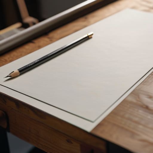
When I first started working with physical paste-ups, there was no “undo” button for a misaligned margin. That sense of consequence stays with me, even now that everything is digital. In your margin and safe zone setup, you have to account for the mechanical reality of the guillotine. I always tell my clients: don’t just design to the edge. You need to build in a generous buffer—the safe zone—to ensure that your critical typography and logos don’t get swallowed by the trim. It’s about creating a visual breathing room that protects the integrity of the composition.
Beyond just avoiding the cut, you have to consider how the paper actually behaves. A margin that looks spacious on a backlit monitor can feel suffocating once it’s pressed onto a heavy, textured stock. I tend to push my margins slightly wider than “standard” because intentional white space provides a structural anchor for the eye. If you’re rushing through your print production workflow, it’s tempting to ignore these gutters, but a mistake here isn’t just a digital error; it’s a physical waste of material.
The Nuance of Paper Stock Selection Guide
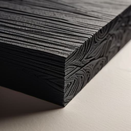
Choosing a substrate is where your digital vision finally meets the physical world, and it’s often where the most profound mistakes happen. You can’t treat a heavy, uncoated cotton stock the same way you treat a slick, coated gloss. When I’m consulting for agencies, I always remind them that the paper isn’t just a background; it’s a participant in the design. A porous, uncoated paper will drink up your ink, leading to significant dot gain and color profiles shifting away from what you saw on your calibrated monitor. If you’re working with deep, moody blacks, a high-absorbency stock might turn your crisp typography into something muddy and indistinct.
I tend to approach this by thinking about the “hand-feel” of the final piece. A heavy, textured cardstock demands a certain level of restraint in your layout—it asks you to respect its presence. Conversely, a lightweight, smooth stock allows for more intricate, fine-lined details. Before you finalize your files, consult a detailed paper stock selection guide tailored to your specific printer. You need to understand how the weight and tooth of the material will interact with your ink density, because once that press runs, the tactile reality is permanent.
The Final Layer: Small Details That Make a Big Difference
- Stop relying on your monitor’s glow to judge color. RGB is a trick of light; CMYK is a reality of ink. Always run a physical test print on a low-end inkjet before committing to a massive production run, because what looks like a soft charcoal on my screen might end up looking like a muddy sludge on heavy cardstock.
- Respect the ink trap. When you’re working with fine serifs or tight kerning, remember that ink spreads slightly as it hits the fibers of the paper—a phenomenon called dot gain. If your type is too delicate, the physical reality of the ink will swallow your hard work, turning elegant strokes into illegible blobs.
- Design with the grain in mind. Paper isn’t a flat, digital plane; it has a direction. If you’re planning a fold or a heavy bind, consider how the grain of the stock will affect the crispness of your layout. Folding against the grain is a quick way to end up with cracked, amateurish edges that ruin the tactile experience.
- Check your resolution, but don’t obsess over “more.” We need 300 DPI for a reason, but more isn’t always better—it’s just more data. Focus instead on the clarity of your vector paths and the intentionality of your raster images. A high-res file with poor composition is still just a loud, messy mistake.
- The “Human Touch” test. Before you hit send to the printer, hold your sketchbook or a piece of heavy stationery. Imagine your design living in that physical space. If the layout feels like it’s fighting the weight of the page rather than sitting comfortably within it, go back to the drawing board. Design should feel held, not just printed.
The Intentionality of the Final Object
Treat your digital file as a blueprint for a physical reality, not just a collection of pixels; every decision you make on screen must account for how ink interacts with fiber.
Respect the limits of the medium by designing with margins that allow the paper to breathe, ensuring the layout feels grounded rather than crowded.
Never underestimate the tactile weight of your choices, because the success of a print piece lies in the sensory connection between the reader’s hand and the material itself.
The Soul of the Tangible
Digital design is about pixels that vanish the moment a screen goes dark, but print is a commitment to physical reality; you aren’t just arranging colors, you are negotiating with the grain of the paper and the way light hits a finished surface.
Ingrid Bellamy
The Final Impression
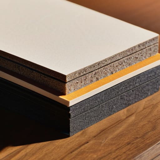
Designing for print is a discipline of patience and precision. We have moved from the technicalities of margins and safe zones to the sensory decision of paper weight and texture, but the core principle remains the same: you are creating something that exists in the physical world. It isn’t enough to simply export a high-resolution PDF and hope for the best. You have to account for the mechanical realities of the press, the way ink bleeds into fibers, and how light hits a specific finish. When we respect these constraints, we stop fighting the medium and start working with it to create something that feels intentional rather than accidental.
As we continue to navigate an increasingly ephemeral digital landscape, I find myself returning to my sketchbook more often than my tablet. There is a weight to a well-designed physical object that a screen can never replicate. My hope is that you approach your next print project not as a chore of technical specifications, but as an opportunity to honor the human touch. Whether it is a minimalist brand identity or a complex editorial layout, remember that your work is destined to be held, felt, and kept. Let that tactile responsibility guide every choice you make.
Frequently Asked Questions
How do I effectively balance the tension between high-contrast digital colors and the more muted reality of physical ink absorption?
This is where most designers lose the thread. Digital screens use light to create vibrancy, but ink relies on absorption and physical spread. To bridge that gap, stop designing for the monitor and start designing for the substrate. I always build in a “dullness buffer.” I intentionally desaturate my digital palette by about 10-15% and check my values against physical proofs. If it looks too clinical on screen, it’ll likely feel lifeless once it hits the paper.
When choosing a paper weight, how much does the intended tactile "feel" of the brand influence the technical decision of stock selection?
It’s everything. In my experience, the weight of the paper is the silent ambassador of your brand. If you’re designing for a high-end boutique, a flimsy 80lb text stock will undermine even the most sophisticated typography. You aren’t just choosing a technical specification; you’re choosing a sensory handshake. I always tell my clients: don’t let the digital mockup fool you. You have to account for that physical gravity—the way a heavy, uncoated stock commands respect before a single word is read.
Beyond the standard bleed settings, how can I better prepare my files to respect the physical limitations of traditional binding methods?
Think beyond the bleed and consider the gutter. When you’re working with perfect binding or even a simple saddle stitch, the inner margin—the gutter—is where the design goes to die if you aren’t careful. I always tell my clients to add extra breathing room near the spine. If your text sits too deep in that fold, it becomes a physical struggle to read. Respect that tension; give your content space to exist without being swallowed by the binding.
