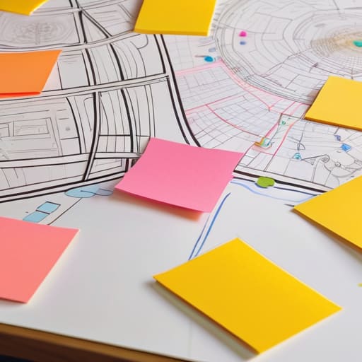
I remember sitting in a dimly lit studio back in the late nineties, surrounded by the smell of spray adhesive and the tactile weight of heavy cardstock, trying to map out a brand’s physical touchpoints with nothing but X-Acto blades and intuition. Today, I see agencies drowning in bloated, over-engineered software that promises to automate the soul out of the process. We’ve turned user journey mapping into this sterile, algorithmic exercise where we chase “frictionless” perfection at the expense of actual human connection. We are so obsessed with smoothing out every bump that we forget a journey is supposed to be felt, not just processed through a seamless, mindless funnel.
I’m not here to sell you on a new suite of expensive SaaS tools or a way to make your workflows look prettier for a stakeholder presentation. Instead, I want to talk about how we can use user journey mapping to rediscover the intentionality of the human experience. I’m going to share what I’ve learned from decades of designing both physical and digital interfaces about finding the value in the pauses, the pivots, and the purposeful friction that makes a user feel truly seen.
Table of Contents
Identifying User Friction Through Deep Empathy Mapping Techniques

When we talk about empathy mapping, I find that most teams fall into the trap of treating it like a checkbox exercise. They grab a sterile customer journey map template, fill in the quadrants with superficial assumptions, and call it a day. But true empathy isn’t about documenting what a user does; it’s about understanding why they hesitate. I’ve learned that the most valuable insights come from looking for the unspoken tension—that split second where a user pauses, frowns, or second-guesses their next click.
To get there, you have to move beyond surface-level data and lean into more rigorous user experience research methods. Instead of just observing a path, I try to sit with the discomfort of the user. Are they feeling overwhelmed by choice? Is the interface demanding too much cognitive load? By identifying user friction through these deeper emotional layers, we stop designing for efficiency alone and start designing for clarity. We aren’t just smoothing out a path; we are ensuring that every interaction feels intentional and respectful of the person on the other side of the screen.
Visualizing User Paths to Honor Human Intent
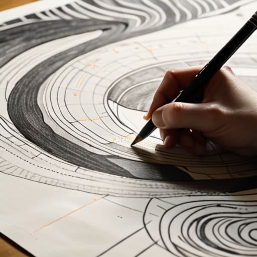
When we move from the raw data of empathy maps to the actual sketching of paths, there is a temptation to reach for a sterile customer journey map template and plug in the findings like a math problem. I’ve seen this happen too often in agency settings—where the visual output becomes a polished, lifeless infographic that satisfies a stakeholder but ignores the actual human pulse. To me, visualizing user paths shouldn’t be about drawing a straight line from point A to point B. It’s about capturing the detours, the hesitations, and the moments where a user pauses to think.
I prefer to approach this stage by treating the map more like a blueprint than a flowchart. Instead of just mapping customer touchpoints as a series of clicks, I try to visualize the emotional weight of each interaction. If a user is navigating a complex interface, their path isn’t just a technical trajectory; it’s a series of micro-decisions influenced by their environment and intent. When we design with this level of granular detail, we stop building mindless corridors and start creating spaces that actually respect the user’s agency.
Five Ways to Keep the Human Element in Your Maps
- Stop chasing the “frictionless” myth. A journey without resistance often feels hollow; instead, look for the moments where a user needs to pause, think, and make a deliberate choice. That’s where the real connection happens.
- Ditch the sanitized personas. When I map a journey, I don’t want to see “User A, age 25-34.” I want to know what they were holding in their hand, what their room looked like, and what kind of mental fatigue they were carrying when they opened your app.
- Use analog tools to find digital truths. I still find that sketching out a flow with a fountain pen on heavy paper reveals structural flaws that a mouse and keyboard tend to smooth over. If a path doesn’t make sense on paper, it won’t make sense on a screen.
- Map the emotional residue, not just the clicks. A user might successfully complete a task but leave feeling depleted or patronized by an over-automated interface. Document the “aftertaste” of each touchpoint to see if your design actually respects their time.
- Audit the “dead zones.” We often focus on the high-traffic paths, but the most critical design failures happen in the quiet gaps between interactions. Map the silence—the moments where the user is left waiting or wondering what comes next.
The Intentionality of the Path
Stop designing for frictionless perfection; instead, look for the meaningful pauses in a user’s journey where they actually engage with the craft.
A map is only as good as the empathy behind it—if you aren’t accounting for the human messiness of a user’s intent, you’re just drawing lines on a screen.
Use your visual maps to protect the creator’s agency, ensuring the digital path serves the person using it rather than forcing them into a pre-set automation.
The Fallacy of the Frictionless Path
We often mistake a seamless, frictionless user journey for good design, but true craftsmanship lies in recognizing where a user actually needs to pause, think, and engage. If we automate away every moment of intentionality, we aren’t designing a tool; we’re just building a treadmill.
Ingrid Bellamy
Beyond the Map

At its core, user journey mapping isn’t just a technical exercise in plotting touchpoints or streamlining a conversion funnel. It is a commitment to seeing the person behind the cursor. We’ve explored how deep empathy allows us to identify those crucial moments of friction, and how visualizing paths can help us honor the intentionality of human movement. When we move away from chasing a frictionless, automated void and instead focus on where a user actually pauses to think, we stop designing for data points and start designing for living, breathing people.
As you return to your desks—or your sketchbooks—I encourage you to look at your maps not as final blueprints, but as evolving dialogues. The most beautiful digital experiences aren’t the ones that feel like they were generated by an algorithm; they are the ones that respect the rhythm of human interaction. Let’s commit to building systems that don’t just bypass the user’s intent, but actively empower it. After all, the goal isn’t to eliminate the struggle, but to ensure that every moment of effort feels deeply purposeful.
Frequently Asked Questions
How do we distinguish between "good" friction that fosters intentionality and "bad" friction that simply frustrates the user?
It comes down to agency. Bad friction is a wall; it’s a broken link, a confusing menu, or a loading spinner that offers no feedback. It’s noise that interrupts the creative flow. Good friction, however, is a pause. It’s that deliberate moment—like a confirmation dialog before a destructive action or a subtle tactile cue—that forces a user to step back from autopilot and re-engage their intention. One creates resentment; the other fosters craftsmanship.
In an increasingly automated landscape, how can we map a journey without losing the nuances of the human touchpoints?
We have to stop designing for the “frictionless” ideal. In my experience, a journey without friction is a journey without soul. To keep the human touch, we must map the pauses—the moments where a user hesitates, thinks, or feels a sense of tactile agency. Instead of smoothing over every bump with automation, look for where the digital experience can mirror the weight of a physical interaction. Map the intention, not just the click.
How do you translate a messy, empathetic empathy map into a clean, functional visual path without stripping away the soul of the data?
The mistake most designers make is treating an empathy map like a data cleanup project. When you sanitize that mess, you lose the very nuance that makes the insight actionable. Instead of smoothing out the edges, I use the “sketchbook method”: I look for the recurring emotional tensions—the jagged parts—and treat those as my primary waypoints. Don’t aim for a sterile flowchart; aim for a map that highlights where the human struggle actually lives.
