I still remember the smell of a high-end print shop in the late nineties—that sharp, heady mix of ozone, solvent, and heavy cardstock. I spent hours hunched over a light table, physically moving pieces of Letraset and adjusting margins with a X-Acto blade, feeling the weight of every decision. Back then, you couldn’t just hit ‘undo’ to fix a mistake in your layout; you had to understand the print design fundamentals before the ink ever hit the paper. There was a terrifying, beautiful friction in that process that forced you to be intentional, a quality I fear is being lost in our era of frictionless, instant digital rendering.
I’m not here to give you a checklist of software shortcuts or a lecture on the latest trendy gradients. Instead, I want to share the hard-won, tactile principles that make a physical object feel significant in a reader’s hands. We are going to strip away the digital noise and get back to the bones of the craft—from understanding paper tooth to mastering the mathematical grace of typography. My goal is to help you build work that doesn’t just occupy space, but commands attention through pure, disciplined intent.
Table of Contents
Honoring Intent Through Typography for Print Media
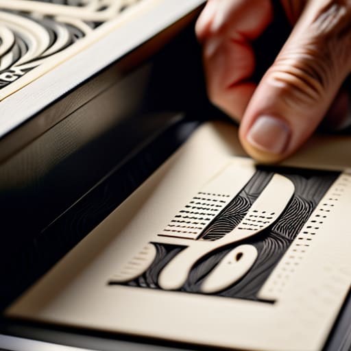
When I sit down with my sketchbook to map out a layout, I’m not just thinking about where the letters sit; I’m thinking about how they will physically meet the paper. In the digital realm, we often treat type as a mathematical arrangement of vectors, but typography for print media requires a much deeper respect for the medium. You have to account for how ink behaves—how it bleeds slightly into the fibers or how a hairline serif might vanish if the weight isn’t calibrated for the substrate. It’s about the tension between the character of the typeface and the physical reality of the press.
This is where the technical meets the soulful. You can have the most beautiful kerning in the world, but if you haven’t mastered your prepress workflow optimization, that beauty will be lost to a blurry edge or a muddy shadow. I always tell my clients that true craftsmanship lies in the details that most people never see: the careful management of ink coverage and density to ensure that your blacks are deep without being heavy, and that your fine lines remain crisp. It’s about ensuring the digital intention survives the transition to the physical world.
Respecting the Edge Margin and Gutter Settings
There is a specific kind of anxiety that sets in when you realize your layout is suffocating. I’ve seen it countless times in agency reviews: a beautiful composition that feels claustrophobic because the designer forgot that paper has physical limits. When we talk about margin and gutter settings, we aren’t just discussing technical whitespace; we are defining the breathing room that allows the eye to rest. If your margins are too tight, the content feels trapped, losing that sense of elegance that only physical media can provide.
The gutter is equally unforgiving. In a book or a multi-page spread, the inner margin is a functional necessity to prevent your text from disappearing into the binding. If you ignore this, you’re essentially asking the reader to fight the object just to consume the content. Mastering these dimensions is a vital part of prepress workflow optimization, ensuring that what you see on your high-resolution monitor actually translates to the tactile reality of the printed page. It’s about respecting the architecture of the medium, ensuring the design works with the physical form rather than against it.
The Tactile Checklist: Five Ways to Respect the Medium
- Choose your paper stock with the same rigor you choose your typeface. A heavy, uncoated cotton paper tells a completely different story than a slick, high-gloss finish; the physical substrate is the silent partner in your design.
- Master the art of the bleed. In the digital world, edges are infinite, but in print, they are a physical reality. Always extend your background elements beyond the trim line to avoid those jarring, accidental white slivers that scream “amateur.”
- Build a hierarchy that breathes. Avoid the temptation to crowd the page. In print, negative space isn’t “empty”—it’s a structural element that guides the eye and gives the reader permission to pause and absorb the content.
- Account for the ink. Remember that colors behave differently when they hit fiber than they do when they glow on a backlit screen. Always design in CMYK and run a physical proof; never trust a calibrated monitor to tell you how the ink will actually settle into the grain.
- Design for the hand, not just the eye. Consider how a person will actually interact with the piece. Will they be flipping pages of a booklet? Is the fold going to obscure a crucial line of text? Respect the ergonomics of the physical object.
The Tactile Checklist: Carrying Intent from Screen to Page
Treat white space not as a void to be filled, but as a structural element that gives your typography room to breathe and your reader room to think.
Always account for the physical reality of the medium; a design that looks flawless on a backlit Retina display can fail miserably once it meets the texture of uncoated paper or the fold of a spine.
Prioritize legibility over mere aesthetics by selecting typefaces that respect the eye’s natural movement, ensuring the craft of the letterform serves the clarity of the message.
The Soul of the Page
In a world of endless scrolling and pixel-perfect automation, print design is our last stand for intentionality; it’s about respecting the weight of the paper and the quiet dignity of a well-placed margin.
Ingrid Bellamy
The Weight of the Physical Page
At its core, mastering print design isn’t about memorizing a checklist of technical specifications; it’s about understanding how those specifications translate into a physical experience. We’ve discussed how typography carries the emotional weight of your message and how margins provide the necessary breathing room for the eye to rest. When you respect the gutter and honor the hierarchy of your type, you aren’t just following rules—you are curating a tactile journey for the reader. Every decision, from the weight of the paper stock to the precise placement of a line of text, serves to bridge the gap between a digital concept and a tangible reality.
As we move further into an era of rapid automation and ephemeral digital scrolling, I find myself returning to my sketchbook more often than ever. It serves as a reminder that true design requires a certain level of resistance—a willingness to slow down and consider the implications of every mark we make. Don’t let the speed of your software dictate the quality of your thought. Instead, strive to create work that feels deliberate and enduring, leaving a mark that stays with the viewer long after they have set the page down. Design with intention, and let the physical world remind you why we create in the first place.
Frequently Asked Questions
How do I balance the need for high-resolution imagery with the practical constraints of file sizes and print production speeds?
It’s a tension we all feel—that tug-of-war between visual fidelity and technical reality. I’ve learned that “bigger” isn’t always “better.” Instead of chasing impossible resolutions, focus on smart compression and working in the correct color space from the start. Use high-resolution assets only where the eye lingers, and don’t be afraid to optimize your files. A heavy, unmanageable file doesn’t make for better design; it just slows down the craft.
When transitioning a brand from digital-first to print, how much of the visual identity should be adapted to respect the tactile nature of paper?
You shouldn’t strip the brand’s soul, but you must respect the medium. Digital colors live in light; ink lives in fibers. If you transplant a neon-bright web palette directly to paper, it will feel flat and lifeless. I always suggest adjusting your color profiles and weight distributions. A typeface that looks crisp on a Retina display might bleed or feel too spindly on uncoated stock. Adapt the execution, not the identity.
Beyond choosing a paper stock, how much does the physical texture of a medium actually influence the way a reader perceives my typographic hierarchy?
It’s everything. Texture dictates the “speed” of reading. A heavy, toothy stock creates a physical resistance that forces the eye to slow down, lending weight and authority to your headlines. Conversely, a smooth, coated surface allows the eye to glide, which can make a complex hierarchy feel more fluid—or, if you aren’t careful, dangerously ephemeral. You aren’t just choosing a surface; you’re choosing how much friction the reader experiences with your type.
