
I remember sitting in a dimly lit studio back in the late nineties, the air thick with the smell of ozone and expensive plotter ink, watching a colleague struggle to render a hyper-realistic landscape that looked more like a plastic toy than a piece of art. We were obsessed with adding more polygons, more detail, more noise, as if complexity were a direct proxy for quality. But there is a profound, quiet dignity in stripping things back. When people talk about low poly art today, they often treat it like a technical limitation or a cheap aesthetic shortcut, but they’re missing the point entirely. It isn’t about what you’re leaving out; it’s about the intentionality of what remains.
I’m not here to give you a tutorial on how to click buttons in a software suite or follow a trend because it looks “retro.” Instead, I want to talk about the craft of reduction. We are going to explore how to use low poly art to create meaningful visual hierarchies and how to find the human friction within geometric precision. I promise to share the kind of perspective you only get from years of watching pixels fight against purpose—no fluff, no hype, just the discipline of design.
Table of Contents
- Mastering Minimalist Geometric Aesthetics Through Purposeful Design
- Low Poly Digital Illustration Techniques for the Human Touch
- The Intentional Edge: Five Principles for Meaningful Low Poly Work
- The Intentionality of the Edge
- The Beauty of the Unfinished Edge
- Beyond the Polygon
- Frequently Asked Questions
Mastering Minimalist Geometric Aesthetics Through Purposeful Design
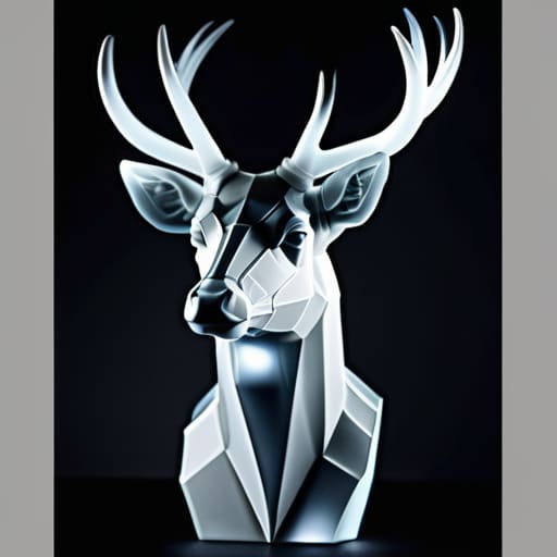
When I sit down with my sketchbook to map out a composition, I’m rarely thinking about complexity. Instead, I’m looking for the structural bones of an image. Achieving minimalist geometric aesthetics requires a disciplined restraint; it is the art of knowing exactly which facet to include and which to discard. It isn’t about making something look “cheap” or unfinished, but rather about finding the precise intersection where a shape conveys enough information to be understood without overwhelming the viewer.
In my practice, I’ve found that the most compelling work comes from treating polygonal mesh modeling as a form of digital sculpture rather than a mere technical task. If you approach it as a way to simplify a form into its most essential truths, the geometry begins to breathe. You aren’t just connecting vertices; you are deciding how light should fall across a surface to evoke a specific mood. This intentionality is what separates a hollow digital render from a piece of design that feels anchored in craftsmanship. Every edge must serve a purpose, ensuring the final result feels deliberate, not accidental.
Low Poly Digital Illustration Techniques for the Human Touch
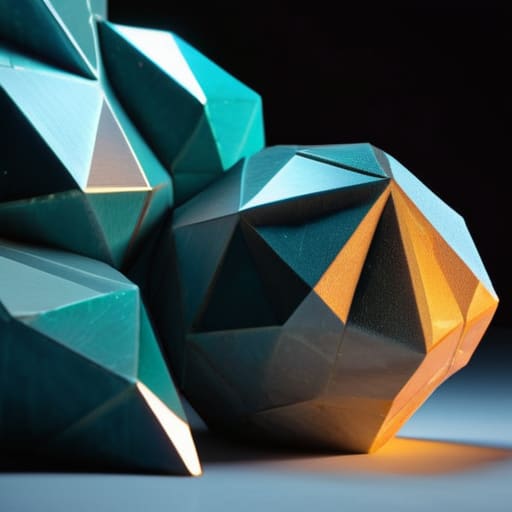
When we talk about low poly digital illustration techniques, there is a tendency to view the process as a purely mathematical exercise—simply connecting vertices to form a surface. But if you treat it like a digital version of stone carving, the result feels entirely different. I often find myself leaning into vector based polygon art because it allows for a level of precision that mirrors the deliberate strokes of a drafting pen. It’s about deciding exactly where a plane should break and where a shadow should fall, ensuring that every facet serves a structural purpose rather than just being a byproduct of a software preset.
The real magic happens when you move away from perfect, sterile symmetry. In my own work with low poly character design, I try to introduce slight irregularities in the polygonal mesh modeling to mimic the way light hits an imperfect, physical object. We shouldn’t be chasing the seamless smoothness of a high-resolution render; instead, we should be looking for the intentionality in the geometry. It is in those sharp, decisive edges that the creator’s hand becomes visible, turning a collection of triangles into something that feels grounded and alive.
The Intentional Edge: Five Principles for Meaningful Low Poly Work
- Prioritize silhouette over detail. In low poly design, you aren’t fighting for every pixel; you are fighting for the strength of the outline. If the shape doesn’t communicate its essence through its primary geometry, no amount of clever shading will save it.
- Treat light as a structural element. Don’t just slap a gradient on a mesh. Think about how light hits a physical facet—how it creates a hard edge or a soft shadow. The goal is to simulate the way light interacts with a tangible, three-dimensional object, even if it’s purely digital.
- Embrace the “imperfection” of the polygon. A perfectly mathematical mesh often feels sterile and lifeless. I find that introducing slight irregularities in the vertex placement can mimic the human hand, giving the piece a sense of character that feels more like a sculpture and less like a calculation.
- Limit your color palette to drive focus. When you reduce the complexity of the form, you increase the impact of your color choices. Use a restrained, thoughtful palette to guide the viewer’s eye toward the focal point, rather than letting a rainbow of polygons create visual noise.
- Respect the negative space. Low poly art is as much about what you leave out as what you put in. Let the geometry breathe. By allowing the background or the surrounding space to interact with your shapes, you create a composition that feels intentional rather than cluttered.
The Intentionality of the Edge
Low poly art is not a shortcut for the lazy; it is a discipline of subtraction that requires you to decide exactly where a shape ends and a shadow begins.
True digital craftsmanship in this style comes from embracing the “friction” of the geometry—using deliberate, jagged edges to create a sense of structure that feels felt, not just rendered.
Avoid the trap of perfect automation; the most compelling low poly work leaves room for the designer’s eye to guide the viewer through the light and the planes, rather than letting an algorithm smooth everything into oblivion.
The Beauty of the Unfinished Edge
Low poly art isn’t about a lack of detail; it’s about the courage to stop before the machine takes over, leaving enough geometric space for the viewer’s imagination to bridge the gap between the polygon and the soul.
Ingrid Bellamy
Beyond the Polygon

We’ve looked at how low poly art transcends mere technical simplification, moving instead toward a disciplined mastery of geometry and light. By focusing on purposeful design rather than just filling pixels, we can use these simplified forms to create something far more evocative than a high-fidelity render could ever achieve. It isn’t about what you leave out, but about how you curate the essential elements to guide the viewer’s eye. Whether you are refining your minimalist aesthetic or applying specific digital illustration techniques to inject a sense of warmth, the goal remains the same: to ensure that every vertex and every facet serves a deliberate, communicative function.
As we continue to navigate an era where automation threatens to smooth away all the interesting edges of our work, I find myself returning to the beauty of these intentional gaps. Low poly design reminds us that there is profound strength in restraint. Don’t be afraid to let the geometry breathe; don’t be afraid to let the viewer’s imagination bridge the distance between the planes. Ultimately, the most impactful digital work is that which respects the human capacity to perceive meaning within simplicity. Keep your tools sharp, but keep your intention even sharper.
Frequently Asked Questions
How do I balance the mathematical precision of low poly geometry with the organic, imperfect feel of traditional hand-drawn art?
The trick lies in resisting the urge to snap every vertex to a perfect grid. In my sketchbook, lines are rarely straight; they have a slight, rhythmic wobble. You can translate this to digital work by intentionally offsetting your polygons. Don’t aim for mathematical perfection; aim for visual weight. Introduce subtle asymmetries and varied edge lengths. By breaking that rigid geometric trap, you allow the viewer to sense a human hand behind the math.
At what point does a low poly composition cross the line from intentional minimalism into looking like a technical limitation or a lack of detail?
It happens the moment the geometry loses its intention. When you see a shape that isn’t a simplification, but a failure to define a silhouette, you’ve crossed that line. True minimalism feels like a choice—a way to guide the eye. If the polygons feel accidental or “lazy,” they stop being an aesthetic and start being a technical shortcoming. The difference lies in whether the geometry serves the form or just fails to finish it.
How can I use lighting and texture to prevent low poly environments from feeling cold and sterile?
The danger of low poly is that it can easily feel like a math equation rather than a place. To fix that, stop treating light as a mere utility and start treating it as atmosphere. Use warm, directional light to create soft gradients across those hard edges—it mimics the way sunlight hits a physical object. Pair this with subtle, non-uniform textures. Even a slight grain or a weathered surface breaks the digital perfection, reintroducing the beautiful imperfection of the real world.
