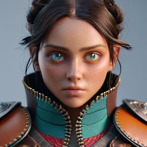
I was sitting in my studio last Tuesday, cleaning the lens of an old Leica, when I realized how much we’ve lost to the “perfection” of modern software. We’ve become obsessed with technical precision, yet we’re drowning in a sea of characters that look like they were spat out by the same sterile algorithm. Most people think stylized character design is just about exaggerating proportions or adding bright colors, but they’re missing the point entirely. They’re chasing a mathematical aesthetic rather than a soulful one. When everything is smoothed out to a frictionless sheen, you lose the very thing that makes a character resonate: the intentional imperfection that signals a human was behind the pen.
I’m not here to give you a checklist of trendy shapes or tell you which software subscription to buy. Instead, I want to talk about the intentionality of form. Over the next few sections, I’ll share how to use stylized character design to build personality through purposeful tension and weight. We’re going to move past the superficial tropes and focus on how to create characters that feel lived-in, tactile, and—most importantly—uniquely human.
Table of Contents
Mastering Shape Language in Character Art
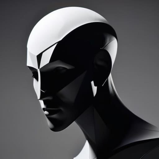
When I first started working with physical paste-ups, you couldn’t hide a mistake behind a layer mask; every cut had to be intentional. I find that same rigor applies to shape language in character art. Before you even think about adding texture or color, you have to get the geometry right. If you rely solely on rendering, you’re just decorating a hollow shell. Instead, I focus on character silhouette theory to ensure that a character’s personality is readable from a mile away, even if they were nothing but a solid black shadow.
A circle suggests softness and approachability, while a sharp, jagged triangle screams danger or instability. It’s a psychological shorthand that works because it taps into something primal. When I’m mentoring junior designers, I tell them to stop obsessing over anatomical perfection and start focusing on visual storytelling through design. If a character is meant to be a weary, weathered veteran, their shapes shouldn’t be pristine; they should feel heavy, perhaps utilizing more grounded, rectangular forms that suggest a certain stubbornness or weight of experience.
Visual Storytelling Through Design and Intent
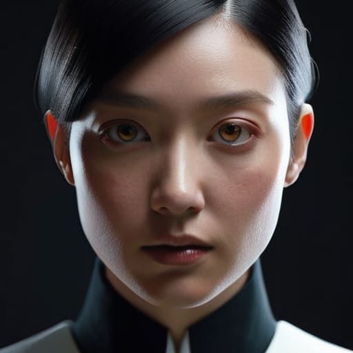
When we talk about visual storytelling through design, we aren’t just talking about making something look “cool” or “cartoony.” We are talking about the quiet, intentional decisions that tell a viewer who a person is before they ever utter a single line of dialogue. I often find that junior designers get lost in the weeds of detail, adding every possible texture or accessory to a model. But true depth comes from artistic simplification techniques—the ability to strip away the noise until only the essence of the character remains. It’s about knowing what to leave out so that the remaining elements can speak louder.
This is where you lean into the power of exaggerated facial features to telegraph emotion or history. A heavy brow isn’t just a stylistic choice; it’s a weight of experience. A sharp, angular jawline isn’t just a shape; it’s a declaration of temperament. When you approach concept art character development with this mindset, you stop treating the character as a collection of assets and start treating them as a living narrative. You aren’t just drawing a figure; you are mapping a soul through geometry.
The Human Element: Five Ways to Inject Soul into Stylization
- Embrace the Imperfection. In my studio, I often find that a perfectly symmetrical face feels clinical and dead. Don’t be afraid to let a character’s features lean slightly off-center or break the mathematical ideal; it’s those tiny, “incorrect” details that make a design feel lived-in and real.
- Prioritize Silhouette Over Detail. Before you get lost in the texture of a character’s jacket or the glint in their eye, step back and look at their shadow. If you can’t recognize who they are just by their outline, your design lacks a strong enough foundation. A great character should be readable even in total darkness.
- Respect the Weight of Materials. Stylization doesn’t mean ignoring physics. If a character is wearing heavy leather, the folds should feel thick and sluggish; if they’re in silk, the lines should be fluid and light. Even in a world of exaggerated proportions, the perceived weight of their gear gives the character a sense of gravity.
- Use Color as a Narrative Tool, Not Just Decoration. I try to avoid picking colors just because they look “cool” on a palette. Every hue should serve the character’s temperament. A character’s palette should act as a shorthand for their history—muted, dusty tones for someone weathered by travel, or sharp, saturated hues for someone brimming with chaotic energy.
- Design for Movement, Not Just a Still Frame. A character isn’t a statue; they are a creature in motion. When you’re sketching, think about how their specific proportions will react to gravity, wind, or sudden impact. A design that looks great in a portfolio but falls apart when the character actually moves is a design that hasn’t been fully realized.
The Human Element in Stylization
Avoid the trap of perfect symmetry; embrace the slight imperfections and organic irregularities that make a character feel lived-in rather than rendered.
Use shape language as a functional tool for clarity, ensuring every silhouette conveys a specific personality trait before a single color is applied.
Design with purpose by prioritizing character intent over visual clutter, making sure every stylistic choice serves the narrative rather than just chasing a trend.
The Soul in the Silhouette
“A character shouldn’t just be a collection of optimized polygons; it should feel like a series of intentional choices. If you strip away the color and the texture, the silhouette alone should tell you who that person is and what they’ve lost along the way.”
Ingrid Bellamy
The Human Element in the Machine Age
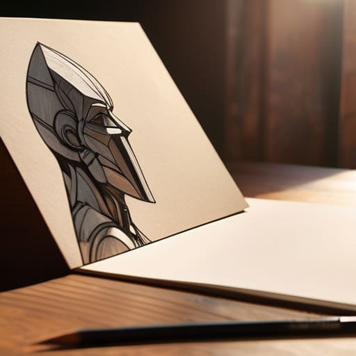
At its core, stylized character design isn’t about how much you can distort a silhouette or how many bright colors you can pack into a palette. It is about the intentionality behind every line. We’ve looked at how shape language dictates a character’s soul and how every design choice must serve a narrative purpose. When we move away from the sterile perfection of mathematical symmetry and instead embrace the deliberate imperfections of a hand-drawn aesthetic, we create something that resonates. Whether you are manipulating a curve to imply kindness or sharpening an angle to signal danger, remember that you are not just moving pixels; you are architecting an emotional response.
As we move further into an era where automation can generate endless iterations in seconds, our value as creators lies in our ability to inject friction and soul back into the work. Don’t let the ease of digital tools make you lazy or clinical. Instead, use them to amplify the human touch that makes a character feel alive, breathing, and flawed. The goal isn’t to create a design that looks perfect on a high-resolution screen, but one that feels like it has a history, a weight, and a heartbeat. Design with intent, and let your characters tell the stories that algorithms simply cannot reach.
Frequently Asked Questions
How do I balance exaggerated proportions without losing the character's underlying anatomical logic?
Think of anatomy not as a rulebook, but as a structural foundation. Even in the most extreme caricature, the viewer’s brain seeks a sense of weight and balance. I always tell my students: find the “anchor point.” If you elongate a limb or swell a torso, ensure the skeletal connection and muscle tension still imply a logical center of gravity. Exaggeration should feel like an expression of character, not a breakdown of physics.
At what point does a stylized design cross the line from "intentional" to just being "unpolished"?
The line is drawn at intent. Unpolished work feels like an accident—a shaky line or a muddy color choice that fails to serve the character. Intentional stylization, however, feels like a decision. If a character has a jagged, asymmetrical silhouette, it should feel like a deliberate choice to convey tension or instability. If the asymmetry feels like a mistake rather than a mood, you’ve lost the craftsmanship and landed in the territory of the unfinished.
How can I maintain a consistent visual language across an entire cast when each character has a unique silhouette?
It’s a delicate balance—trying to honor individuality without letting the world feel fractured. I find the answer lies in a shared “visual DNA.” Think of it like a typeface family: each character needs its own distinct weight and personality, but they must all share the same underlying structure. Establish a unified constraint—perhaps a specific color palette, a recurring line weight, or a consistent level of geometric abstraction. Use these common threads to anchor the silhouettes.
