
I remember sitting in a dimly lit studio back in the late nineties, the smell of ozone from a heavy plotter printer hanging in the air, trying to manually map out spatial depth on a drafting table. There was a certain weight to every line, a tactile consequence to every angle. Today, I see designers rushing to slap a generic isometric illustration onto a landing page just because it looks “modern” or “techy,” treating it like a decorative sticker rather than a structural tool. We’ve traded that hard-won spatial logic for a fast-food aesthetic that lacks any real soul or intention.
I’m not here to teach you how to follow a trendy tutorial or click through a preset library. Instead, I want to talk about how to use these three-dimensional perspectives to build meaningful visual hierarchies that actually respect the user’s eye. We are going to strip away the fluff and look at how to use isometric illustration to ground your digital interfaces, giving them a sense of tangible, human-centric structure that feels earned rather than automated.
Table of Contents
Mastering Isometric Projection Techniques With Purpose
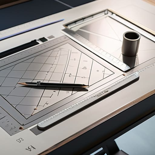
When you sit down to work, don’t just treat the software as a way to automate a look; treat it as an extension of your drafting table. Mastering the craft requires a deep understanding of axonometric drawing principles to ensure that your shapes don’t just look “cool,” but actually feel structurally sound. I often find that designers rush into 3D vector illustration styles without first establishing a solid foundation. If your angles are off by even a fraction of a degree, the entire illusion of weight and stability collapses, leaving the viewer with a sense of visual unease.
To avoid this, I always recommend starting with a rigorous isometric grid design. This isn’t about being rigid for the sake of it; it’s about creating a reliable scaffold that respects the geometry of the space you’re building. Unlike the vanishing points you’d find in standard perspective, this method allows you to maintain scale across the entire composition. By focusing on these intentional structural relationships rather than just decorative flourishes, you ensure that your work feels grounded, purposeful, and—most importantly—human.
Beyond Flatness Axonometric Drawing Principles for Creators
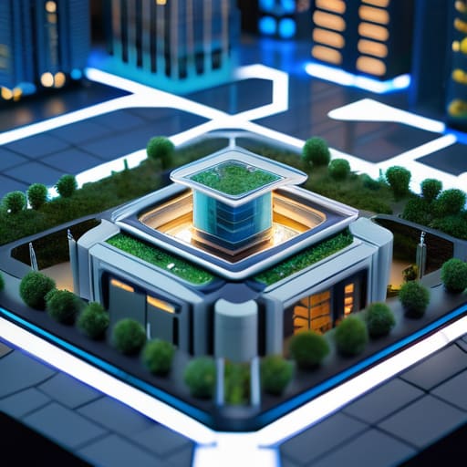
When we move away from the vanishing points of traditional perspective, we enter the realm of axonometric drawing principles, where scale remains constant regardless of distance. In a standard perspective drawing, things shrink as they recede, which can feel intuitive but often sacrifices the mathematical clarity needed for precise technical layouts. By contrast, working with an isometric grid design allows us to maintain a sense of structural honesty. You aren’t tricking the eye into seeing a fake depth; you are presenting a highly organized, readable map of a digital space.
For those of us who grew up with drafting tables, there is a certain comfort in this lack of distortion. It’s about understanding the orthographic projection basics—treating the X, Y, and Z axes with equal weight. This approach prevents your work from feeling like a mere visual gimmick. Instead of chasing a fleeting sense of realism, you are building a framework where every object feels deliberately placed and measurable. It’s this tension between the mathematical rigor of the grid and the organic way we interpret space that makes this style so enduringly effective for complex interfaces.
Five Ways to Keep Your Isometric Work from Feeling Sterile
- Respect the scale. It’s easy to get lost in the math of a 30-degree angle, but if your objects don’t feel like they share the same physical reality, the illusion breaks. Ensure your proportions feel grounded, not just mathematically correct.
- Introduce intentional imperfection. Digital isometric grids can feel clinical and cold. I like to break the perfect line occasionally—a slightly wobbly edge or a hand-drawn texture—to remind the viewer that a human hand guided the design.
- Use light to create hierarchy, not just depth. Don’t just default to a standard top-down shadow. Use light to direct the eye toward the most important part of your composition, treating light as a storytelling tool rather than a technical requirement.
- Avoid the “floating object” trap. To give your illustration a sense of place, make sure your elements feel like they are interacting with a surface. A subtle contact shadow or a slight overlap can transform a collection of shapes into a cohesive environment.
- Limit your palette to maintain focus. Isometric views can quickly become visually overwhelming because of the extra dimension. Stick to a disciplined color story so the complexity of the perspective doesn’t compete with the clarity of your message.
The Intentionality of Depth
Treat isometric elements as structural anchors rather than mere decoration; every angle should serve to guide the eye and ground the user in a tangible space.
Respect the geometry by maintaining consistent projection angles, ensuring that the technical precision of the illustration reflects the professional rigor of your brand.
Avoid the trap of visual clutter by using depth to create hierarchy, letting the three-dimensional form clarify information rather than obscuring it under unnecessary complexity.
The Soul in the Structure
Isometric illustration shouldn’t be a shortcut to visual complexity; it should be a deliberate choice to give digital interfaces a sense of weight and architectural integrity that flat design often lacks.
Ingrid Bellamy
Finding the Soul in the Geometry
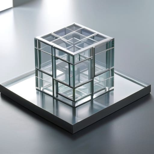
As we’ve explored, isometric illustration is far more than a clever way to add a sense of dimension to a flat interface. It is a deliberate choice to bridge the gap between the digital void and the tangible world. By mastering axonometric principles and moving beyond simple decorative flourishes, we ensure that every angle and every line serves a specific communicative function. We aren’t just adding depth for the sake of a trend; we are using geometric intentionality to guide the eye and provide a sense of structural integrity. When we treat these illustrations as part of a cohesive architectural language rather than mere eye candy, we honor the fundamental purpose of design: clarity through structure.
In an era where we can generate infinite imagery with a single prompt, I find myself returning to the importance of the human hand in every technical decision. Whether you are sketching out your initial projections in a physical notebook or refining a vector path on a high-resolution screen, remember that the goal is to create something that feels grounded. Don’t let the precision of the grid strip away the soul of your work. Use these isometric tools to build digital environments that feel as meaningful and tactile as the physical objects we touch every day. Design with purpose, and let the geometry serve the story.
Frequently Asked Questions
How do I prevent isometric illustrations from feeling too clinical or "mathematically perfect" when I'm trying to maintain a hand-drawn, human touch?
The trap of the digital grid is its obsession with perfection. To break that clinical chill, you have to introduce intentional imperfection. I often go back to my sketchbook for this; I’ll hand-draw the basic shapes, then scan them in. If you’re staying digital, slightly vary your line weights or allow your paths to wander just a hair from the mathematical ideal. It’s about adding that subtle, human friction that reminds the viewer a person was actually there.
At what point does adding isometric depth become a distraction from the actual user interface rather than a functional design choice?
It becomes a distraction the moment the illustration stops guiding the eye and starts competing with it. If I’m looking at a dashboard and my gaze is pulled toward a decorative isometric cityscape instead of the critical data points, the design has failed. Depth should act as a visual scaffold, providing structure and hierarchy. If the “flair” creates cognitive friction or obscures the path to action, it’s no longer design—it’s just noise.
How can I effectively integrate isometric elements into a brand identity without making the entire visual system feel overly complex or heavy?
The trick is restraint. Don’t let the isometric elements dictate the entire visual language; treat them as accents, not the foundation. I find it works best to use them for specific, high-impact moments—perhaps a single hero graphic or a subtle way to illustrate a complex service. If you pair these three-dimensional shapes with plenty of negative space and clean, two-dimensional typography, you create a balance that feels intentional rather than cluttered.
